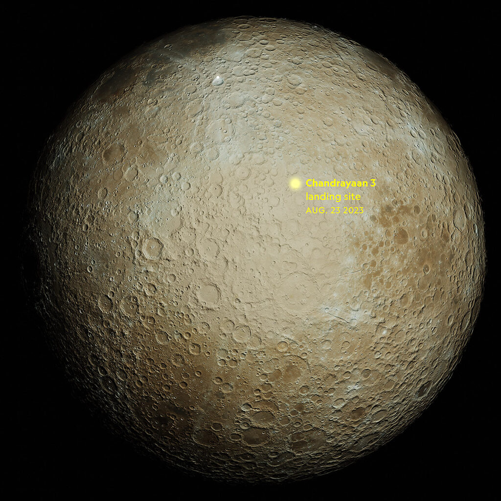
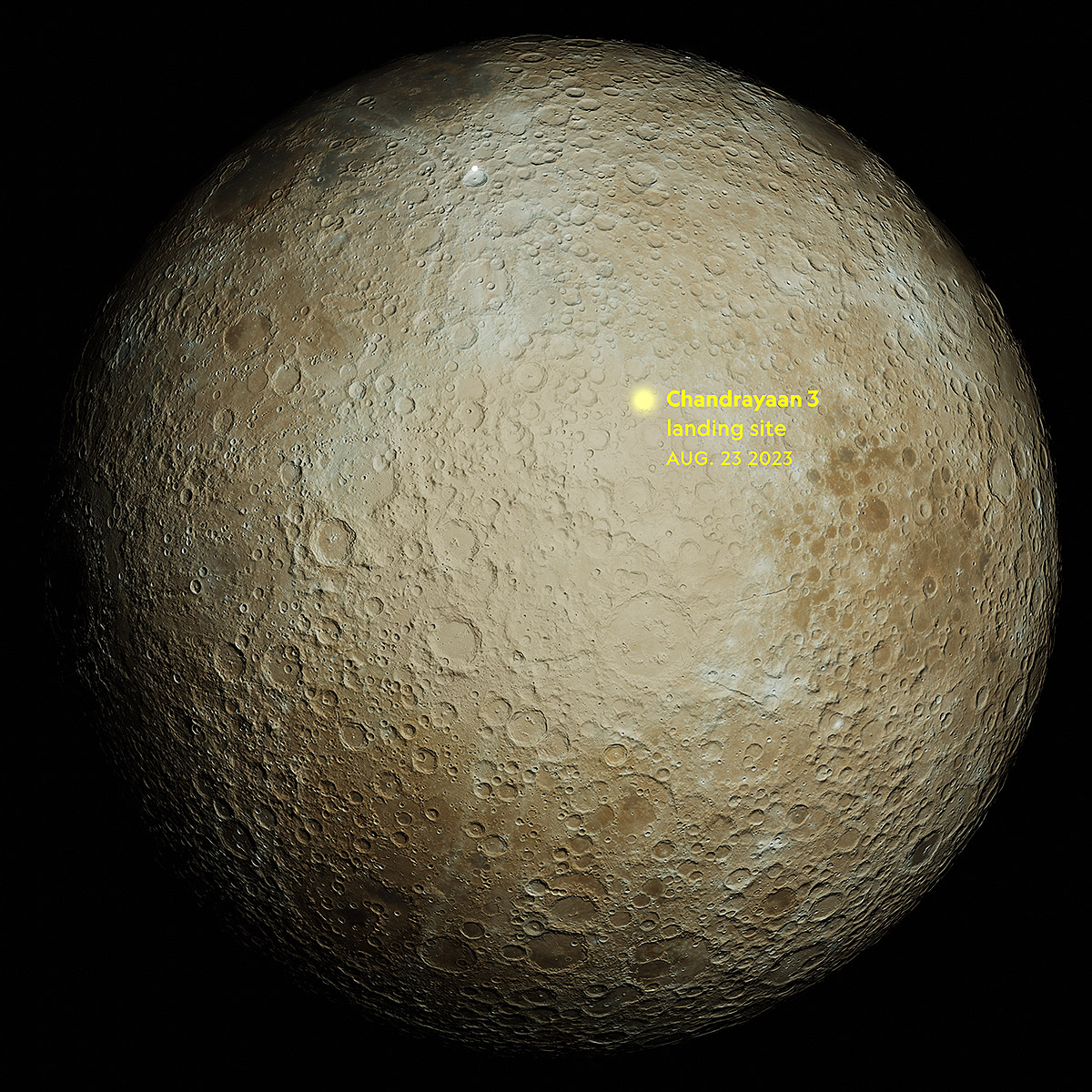
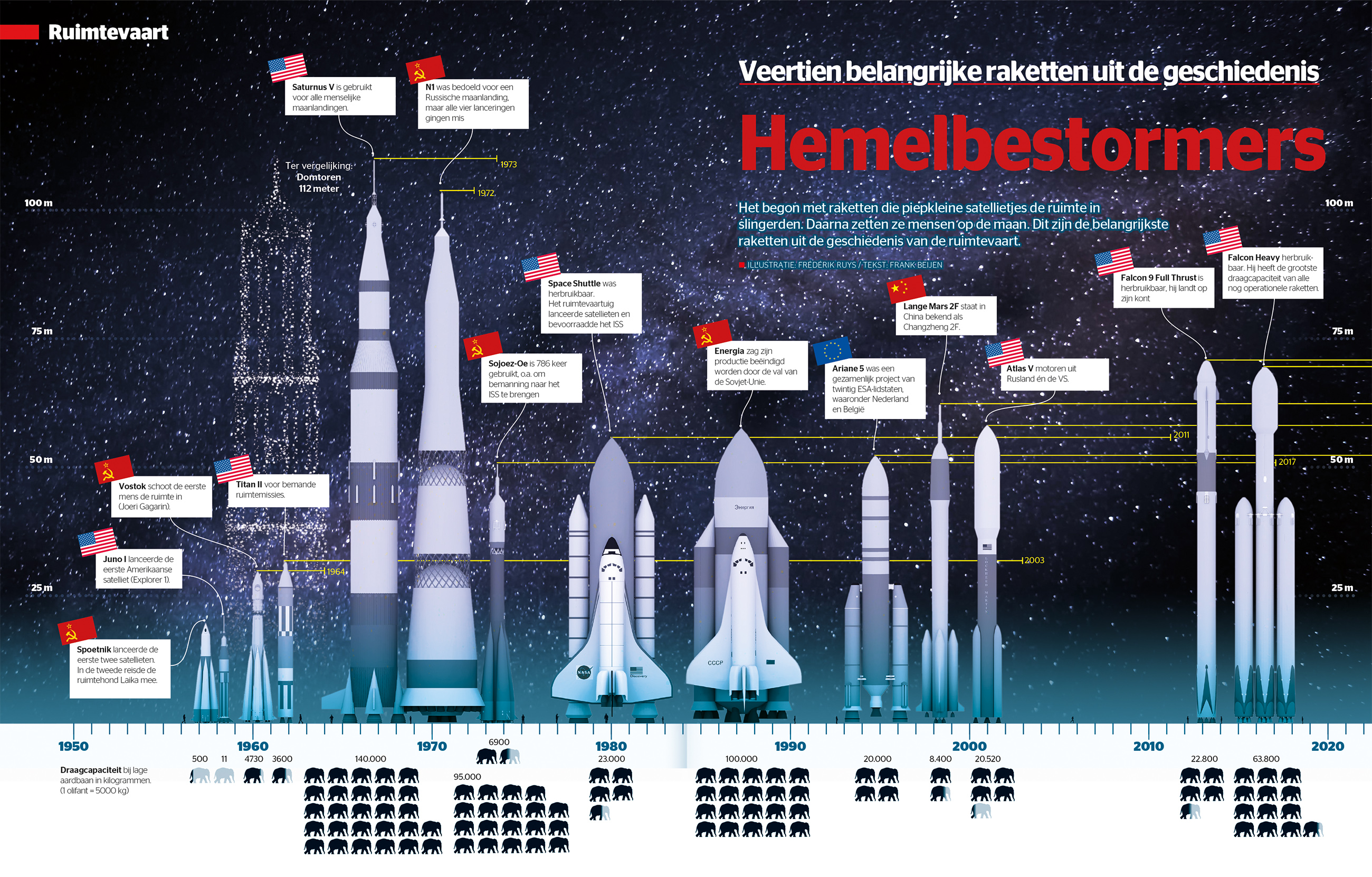
Moon landings
1966 – 2023
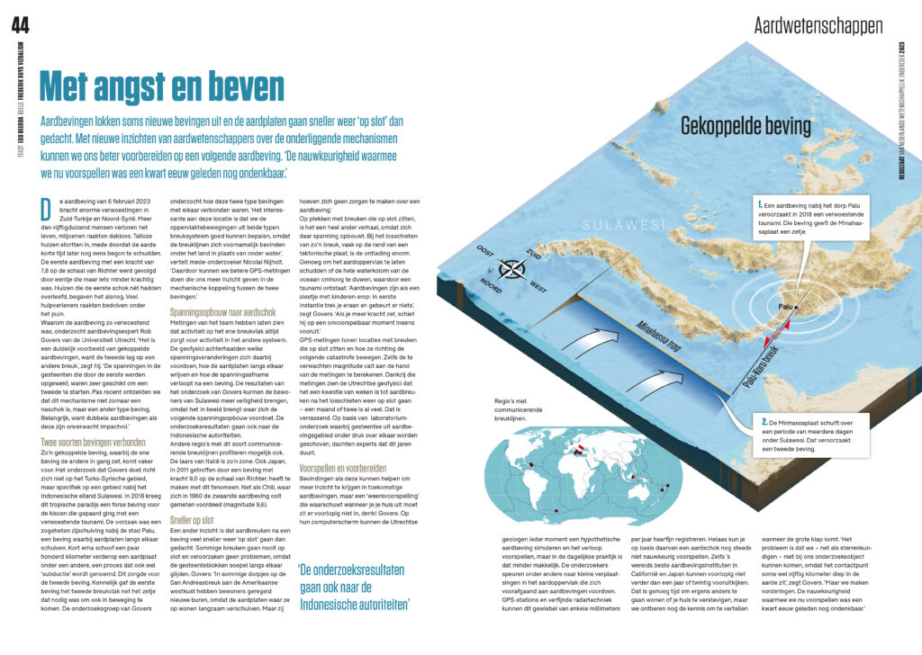
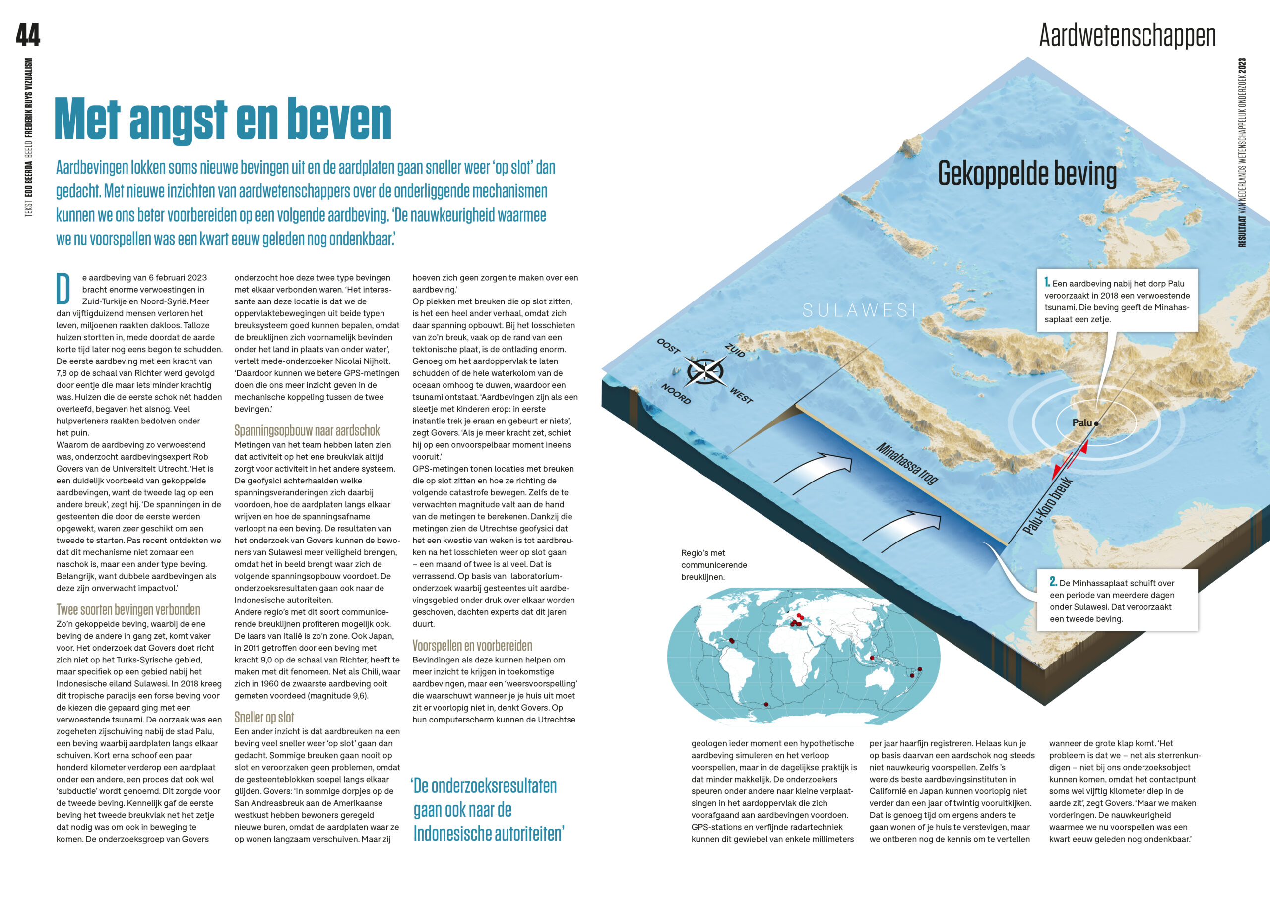
Onderzoek naar gekoppelde aardbevingen
Aardbevingen lokken soms nieuwe bevingen uit. Met nieuwe inzichten over de onderliggende mechanismen kunnen we ons beter voorbereiden op een volgende aardbeving.
Meer info



.embed-container { position: relative; padding-bottom: 56.25%; height: 0; overflow: hidden; max-width: 100%; } .embed-container iframe, .embed-container object, .embed-container embed { position: absolute; top: 0; left: 0; width: 100%; height: 100%; }
Geanimeerde infographic over de Rijksbegroting 2010 gepresenteerd op Prinsjesdag, door Frédérik Ruys, www.vizualism.com, in opdracht van de Rijksvoorlichtingsdienst en het Ministerie van Financiën.
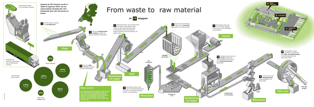 Post shredder technologie is een belangrijke stap op weg naar de doelstelling van 95% recycling van autowrakken. Visualisatie voor Auto Recycling Nederland van de scheidingstechnieken in zo’n fabriek.
.embed-container { position: relative; padding-bottom: 56.25%; height: 0; overflow: hidden; max-width: 100%; } .embed-container iframe, .embed-container object, .embed-container embed { position: absolute; top: 0; left: 0; width: 100%; height: 100%; }
Geanimeerde infographic over de Gevolgen van de crisis als toelichting bij de Rijksbegroting 2010, gepresenteerd op Prinsjesdag, in opdracht van de Rijksvoorlichtingsdienst en het Ministerie van Financiën.
Politiekverslaggever Ron Freesen legt het nog een keertje uit met behulp van de infographic .
.embed-container { position: relative; padding-bottom: 56.25%; height: 0; overflow: hidden; max-width: 100%; } .embed-container iframe, .embed-container object, .embed-container embed { position: absolute; top: 0; left: 0; width: 100%; height: 100%; }
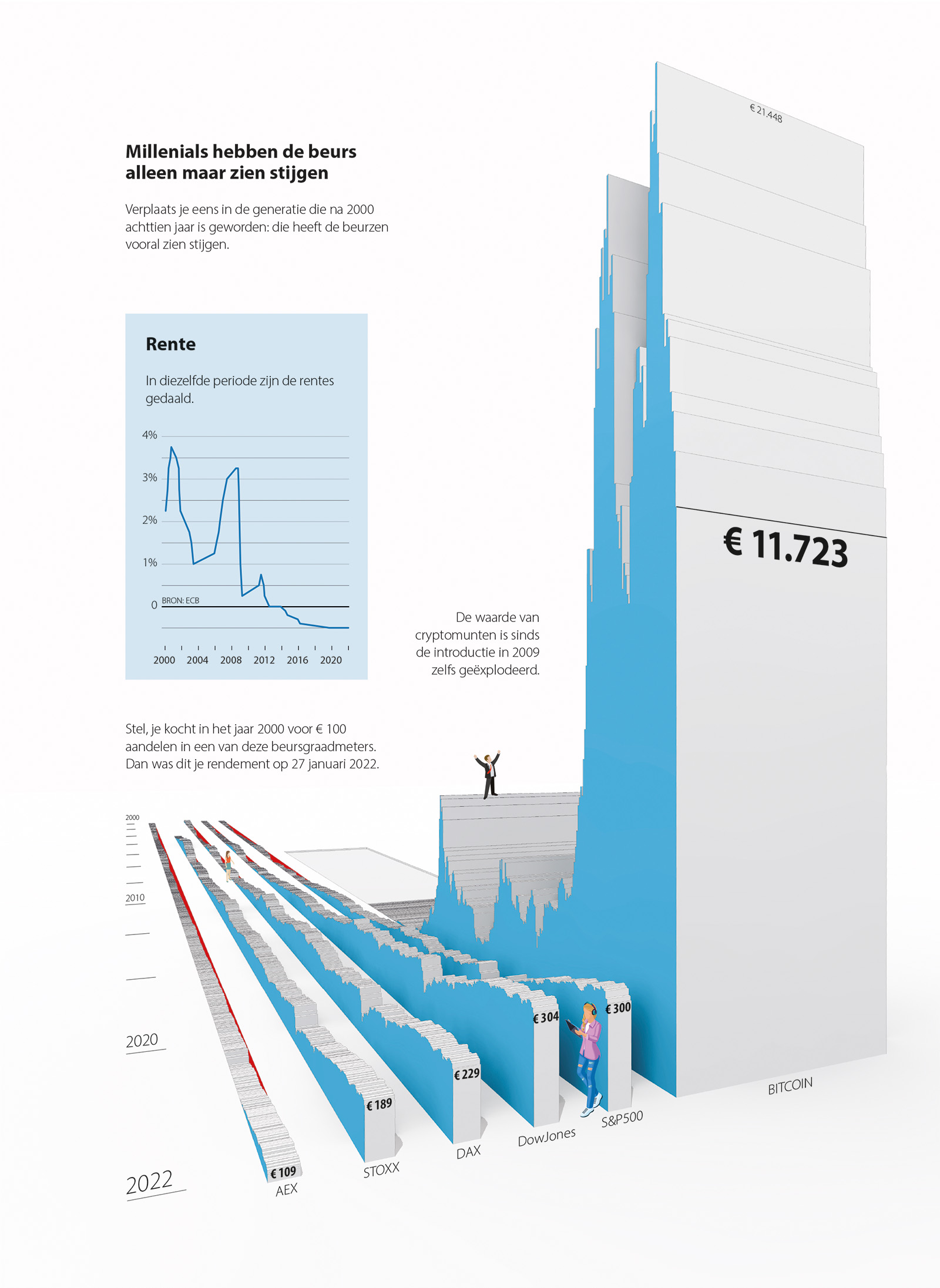
The horizon chart appeared to be the most effective way to visualize the dropping of stocks on the Amsterdam Exchange from January 2007 to December 2008. All funds – without exception – turned red. Especially the informative labels on the charts, highlighting crucial moments in the financial crisis, changed the datavisualisation into an information graphic. Designed by Frédérik Ruys, published in Het Financieele Dagblad on december 20th, 2008.
As the visualisation method needed some explanation to a broader audience than just the readers of the Dutch newspaper, I made the explanation above.
.embed-container { position: relative; padding-bottom: 56.25%; height: 0; overflow: hidden; max-width: 100%; } .embed-container iframe, .embed-container object, .embed-container embed { position: absolute; top: 0; left: 0; width: 100%; height: 100%; }
How to land on water. Minute by minute reconstruction of the emergency landing on the Hudson River near Manhattan (New York) on january 15th 2009 by captain Chesley B. Sullenberger III and co-pilot Jeffrey Skiles with their Airbus A320 of U.S. Airways flight 1549. Infographic and research by Frédérik Ruys, Vizualism 2009.
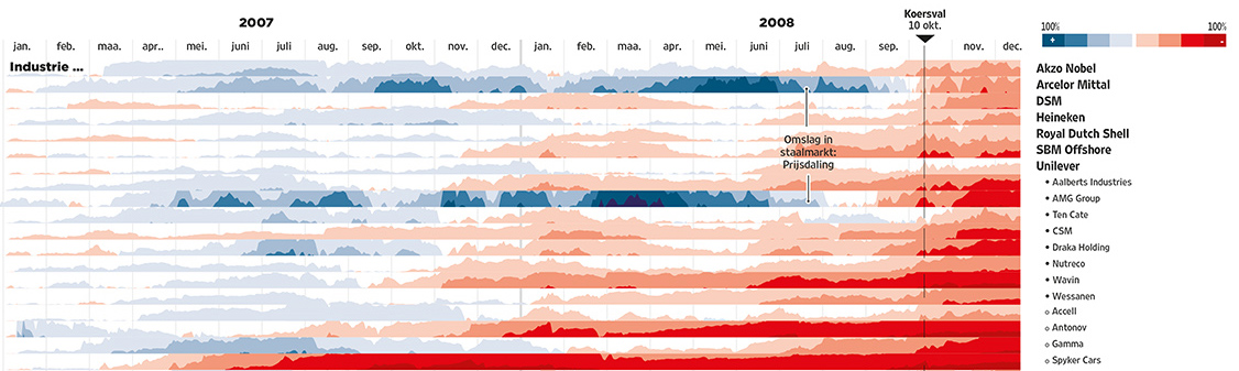 In de zomer van 2007 begon ik als infographicredacteur bij het Financieele Dagblad om de titel te helpen bij de transitie naar een meer visueel gerichte krant. Tegelijkertijd kwamen in de VS de eerste voortekenen van wat later de kredietcrisis is gaan heten. Het werd een spannende tijd met complexe gebeurtenissen die op een heldere manier uitgelegd moesten worden aan de lezer. Aan het eind van 2008 – en een aantal genationaliseerde (en omgevallen) banken verder – bereikte de crisis zijn dieptepunt en was het tijd voor een overzicht hoe deze crisis ook de Nederlandse aandelenhandel getroffen had.
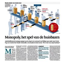 De infographic van Frédérik Ruys in het Financieele Dagblad over de grootste vastgoedfraudezaak in Nederland ooit, is genomineerd voor de Infographicjaarprijs. De uitreiking vindt op 20 september plaats in het Graphic Design Museum in Breda.
De vakjury bestond uit Rijk Boerma (Mijksenaar), Erik van Heeswijk (Nederlandse Vereniging van Journalisten), Karin Schwandt (winnaar Infographics Jaarprijs 2003), Hennie van der Zande (grafisch ontwerper en kunsthistorica) en Juantxo Cruz Ortiz de Landazuri (hoofd infographics El Mundo).
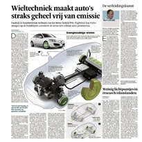 In het eerste jaar dat ik bij het Financieele Dagblad werkzaam was, werd mijn infographic over zuinige aandrijftechniek voor auto’s gekozen als winnaar van de European Newspaper Design Award. De pagina verscheen in de eerste week van het FD nieuwe stijl.
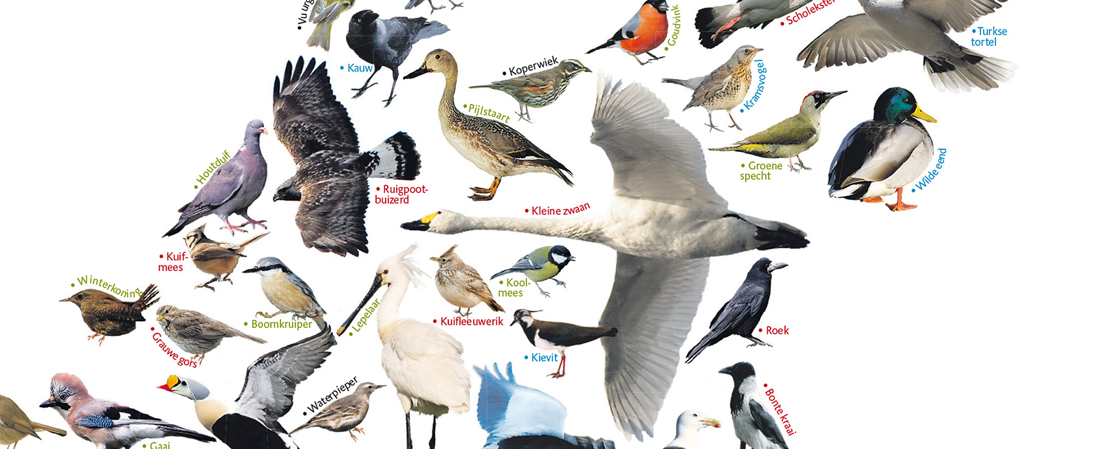
De vogelstand in Nederland; 2008. Wegener Dagbladen, SOVON Vogelonderzoek, Vogelbescherming.
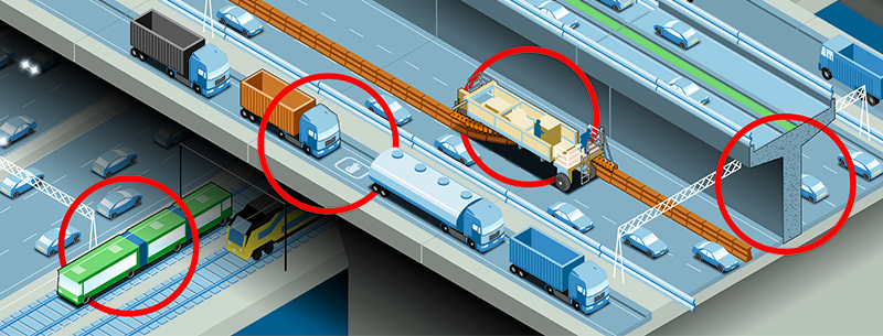
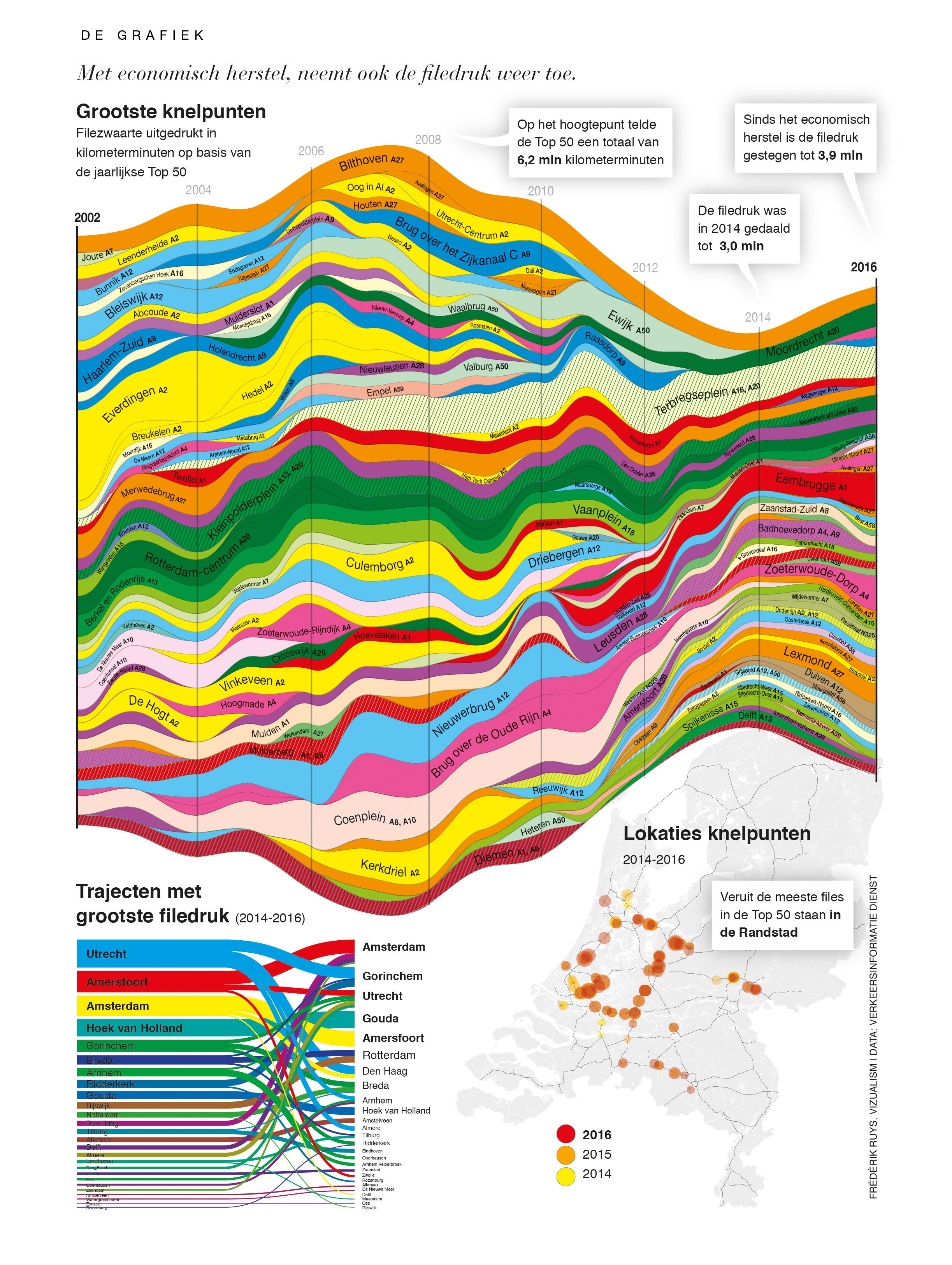
De zoektocht naar fileoplossingen zorgt voor veel noviteiten maar ze zijn niet alle even bruikbaar. Voor de speciale ‘Logistiek & Mobiliteit’ bijlage van het Financieele Dagblad van 15 april 2008 zetten we de noviteiten op een rijtje.
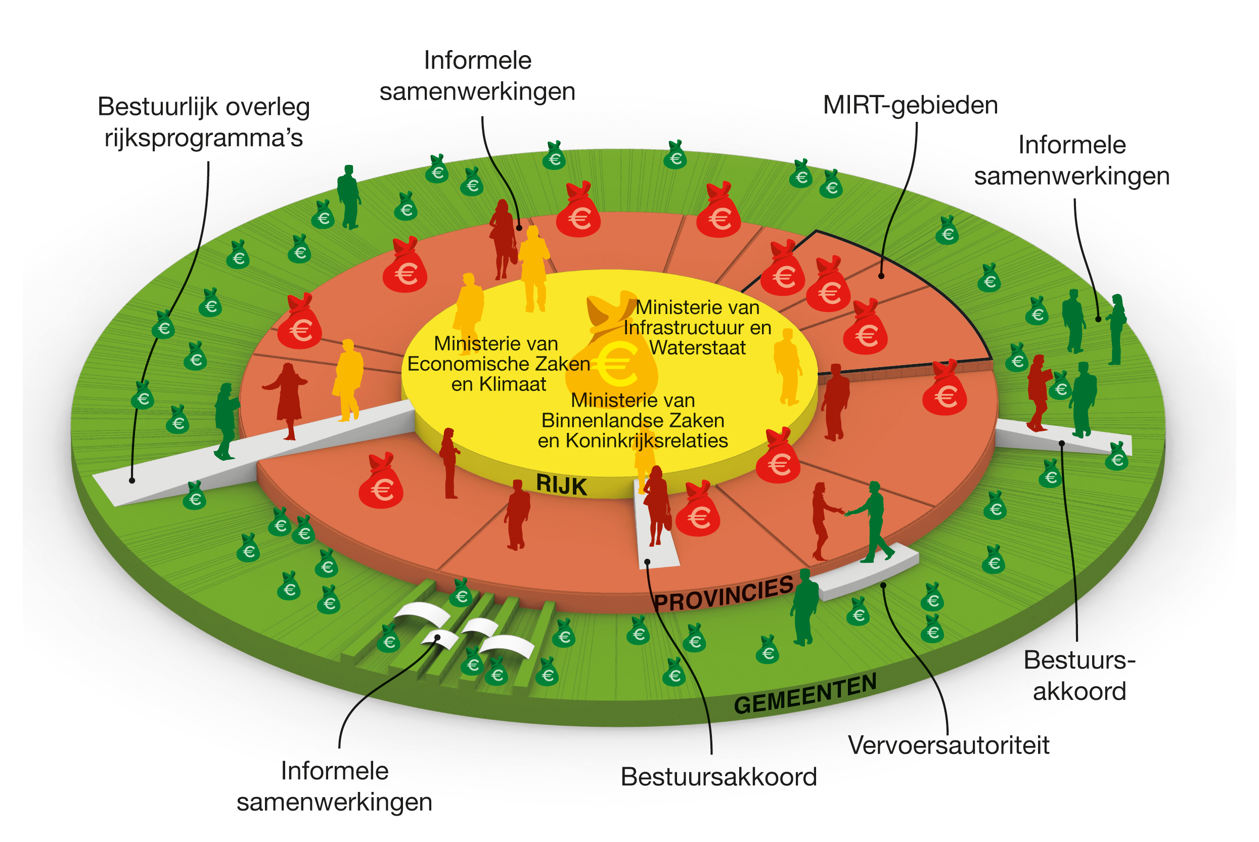
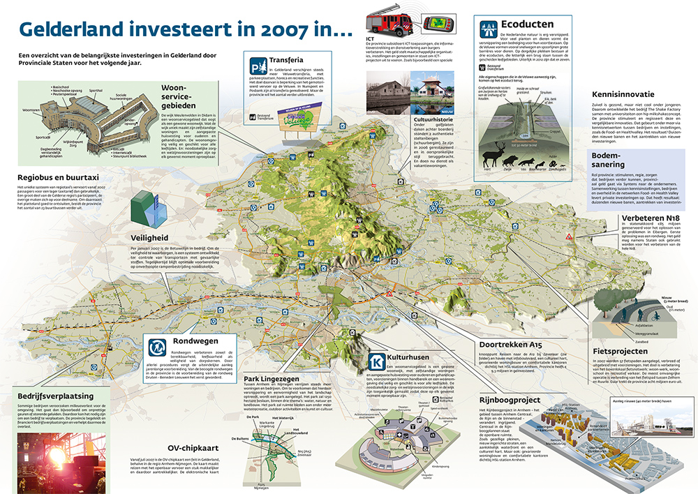 De provincie Gelderland doet dingen die voor een gemeente te groot en voor het Rijk te klein zijn. In het hart van Gld.leeft brachten we de belangrijkste projecten in kaart.
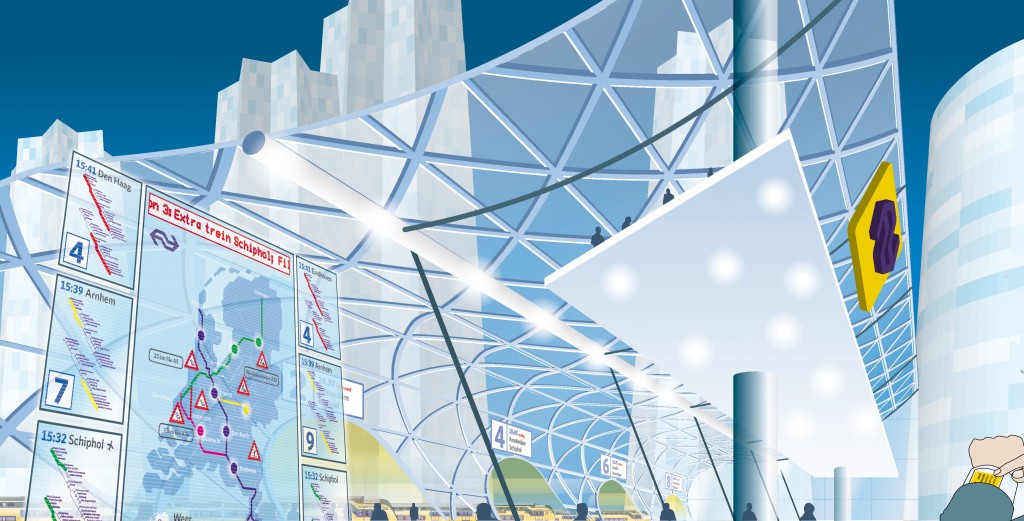
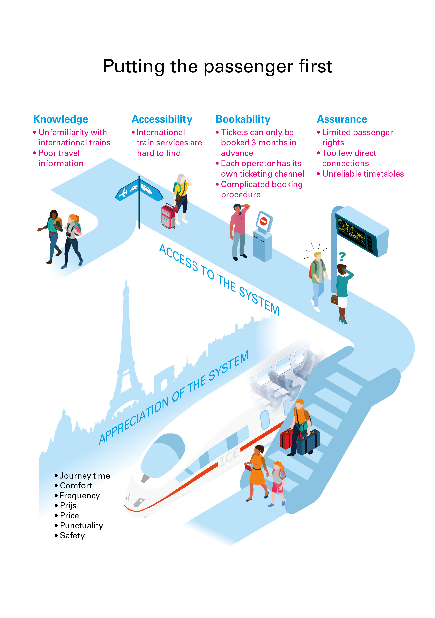
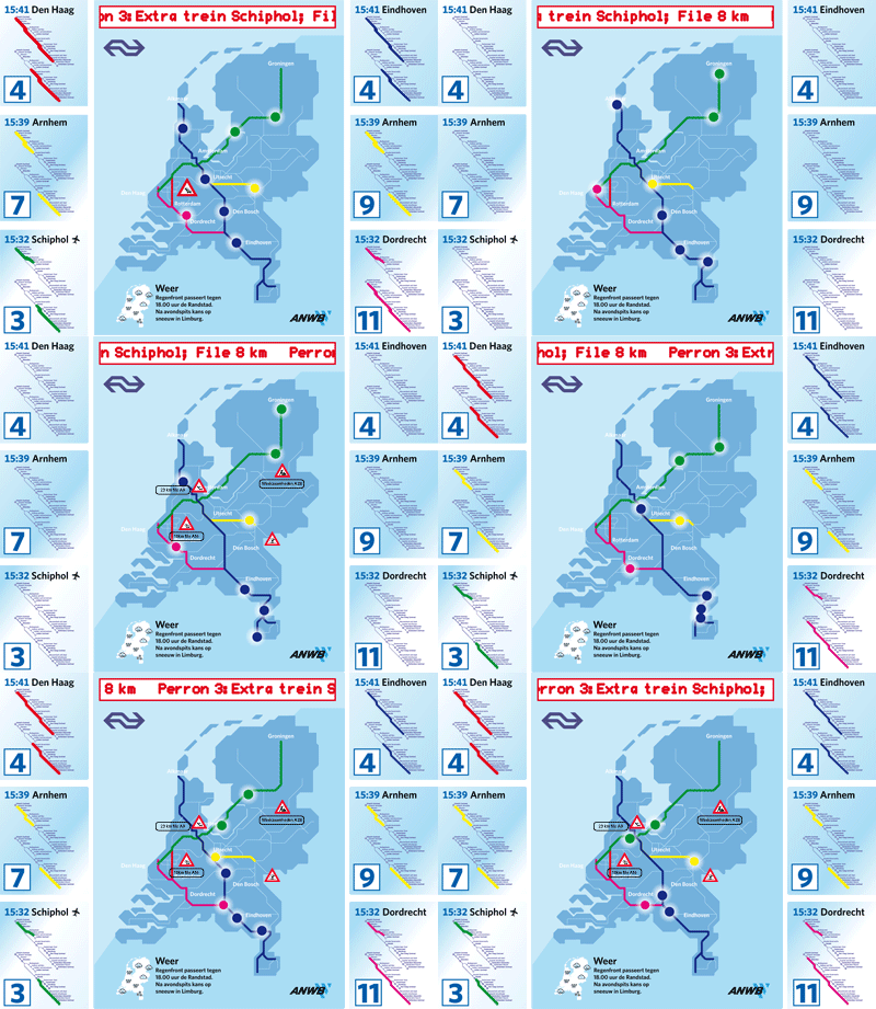 Voor de NS ontwikkelden we in 2006 een aantal illustraties ter ondersteuning van de toekomstvisie NS 2020. Deze schetsen werden later verwerkt tot animatie.
De Nederlandse Spoorwegen verwachtte destijds dat het aantal reizigers in de periode tot en met 2020 fors groeit. Toen vervoerde NS ongeveer een miljoen personen per dag. Dat zouden er volgens de visie van het vervoersbedrijf meer dan 1,5 miljoen zijn.
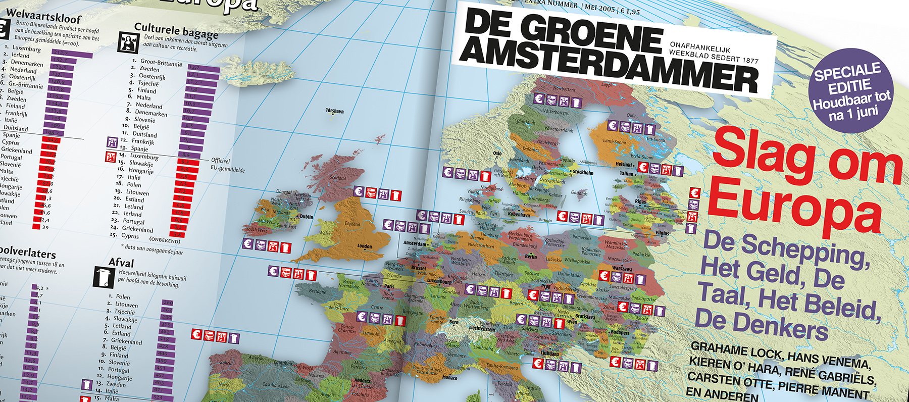
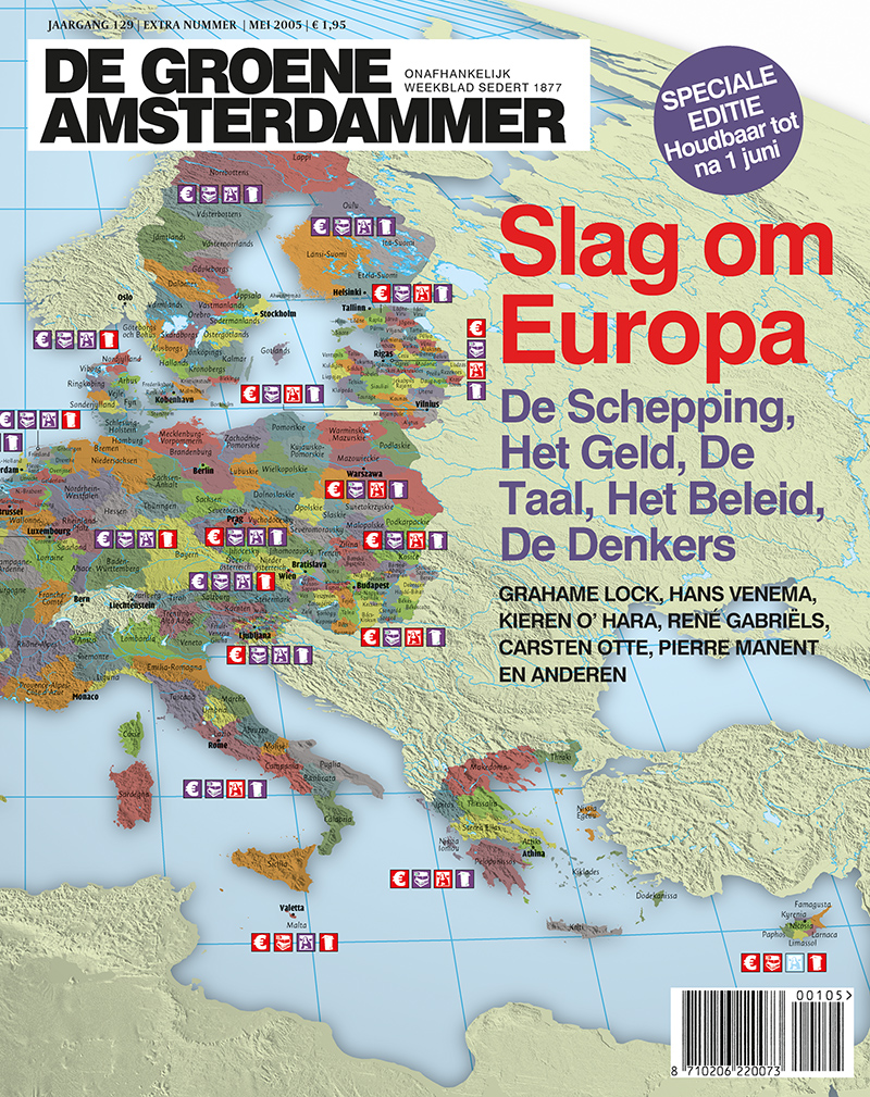 Omslag voor de Europa-special van De Groene die verscheen aan de vooravond van het referendum over de Europese Grondwet. Het Europa van de regio’s, geïnspireerd naar Heinekens Eurotopia.
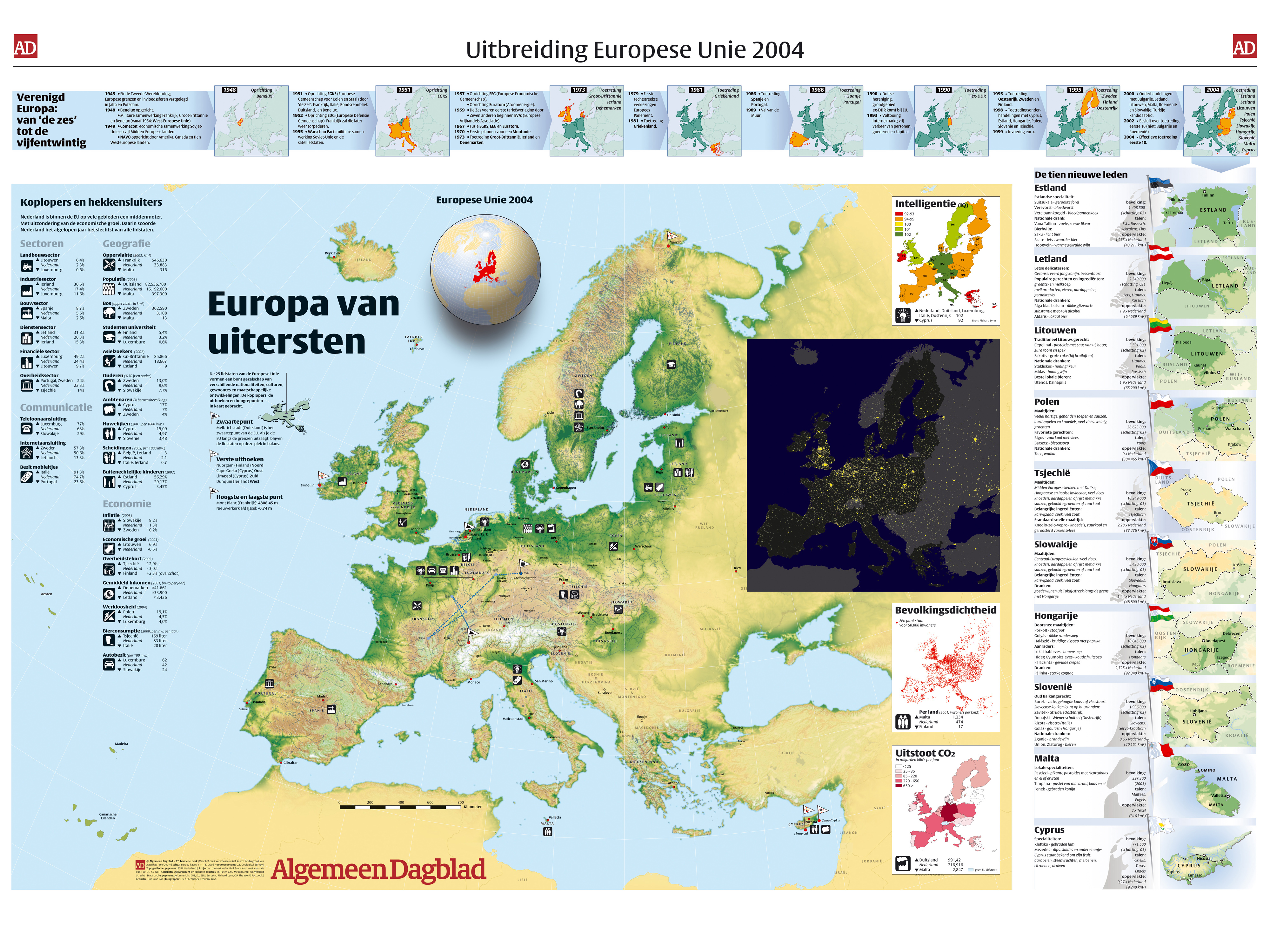
Towards the acceptance of new EU-members in 2004, I worked on a spread for the Dutch daily Algemeen Dagblad about the European Union, showing the differences and similarities of the countries, titled: ‘The Extremities of the EU’. Also we calculated in collaboration with the University of Utrecht how the geographical centre of the EU has moved in the course of time.
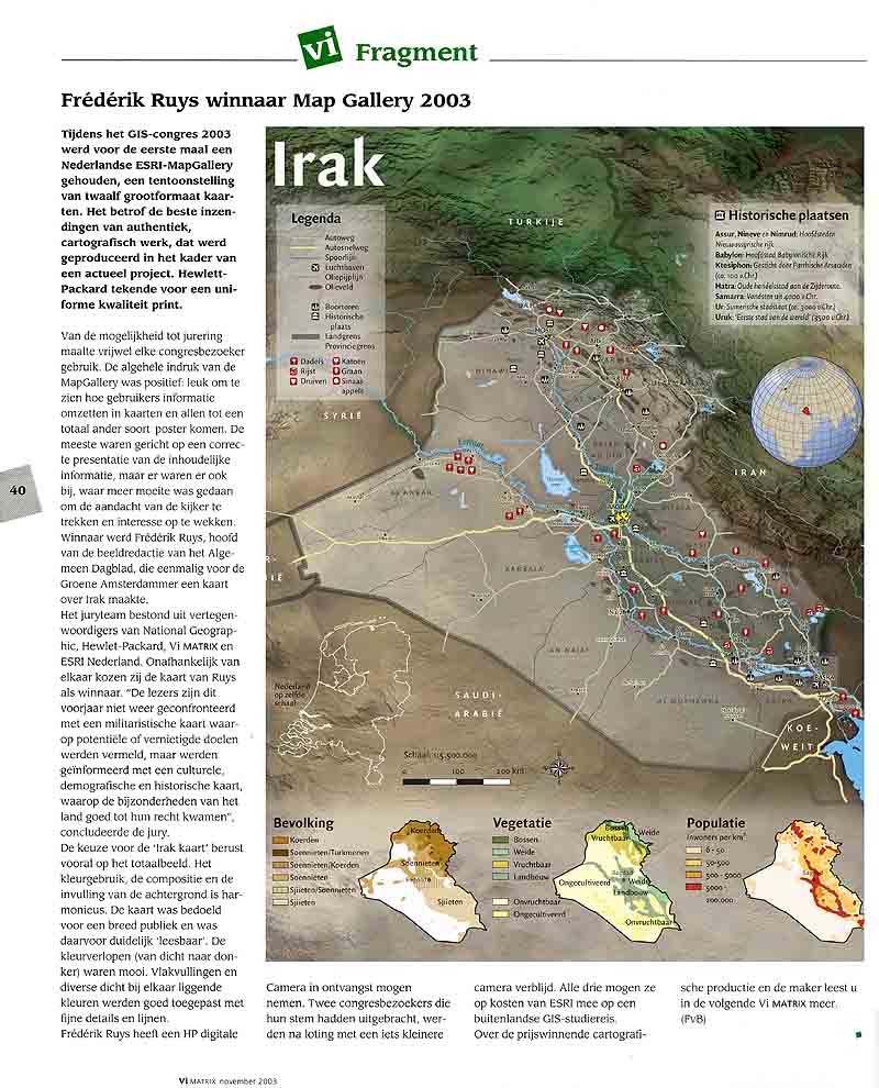
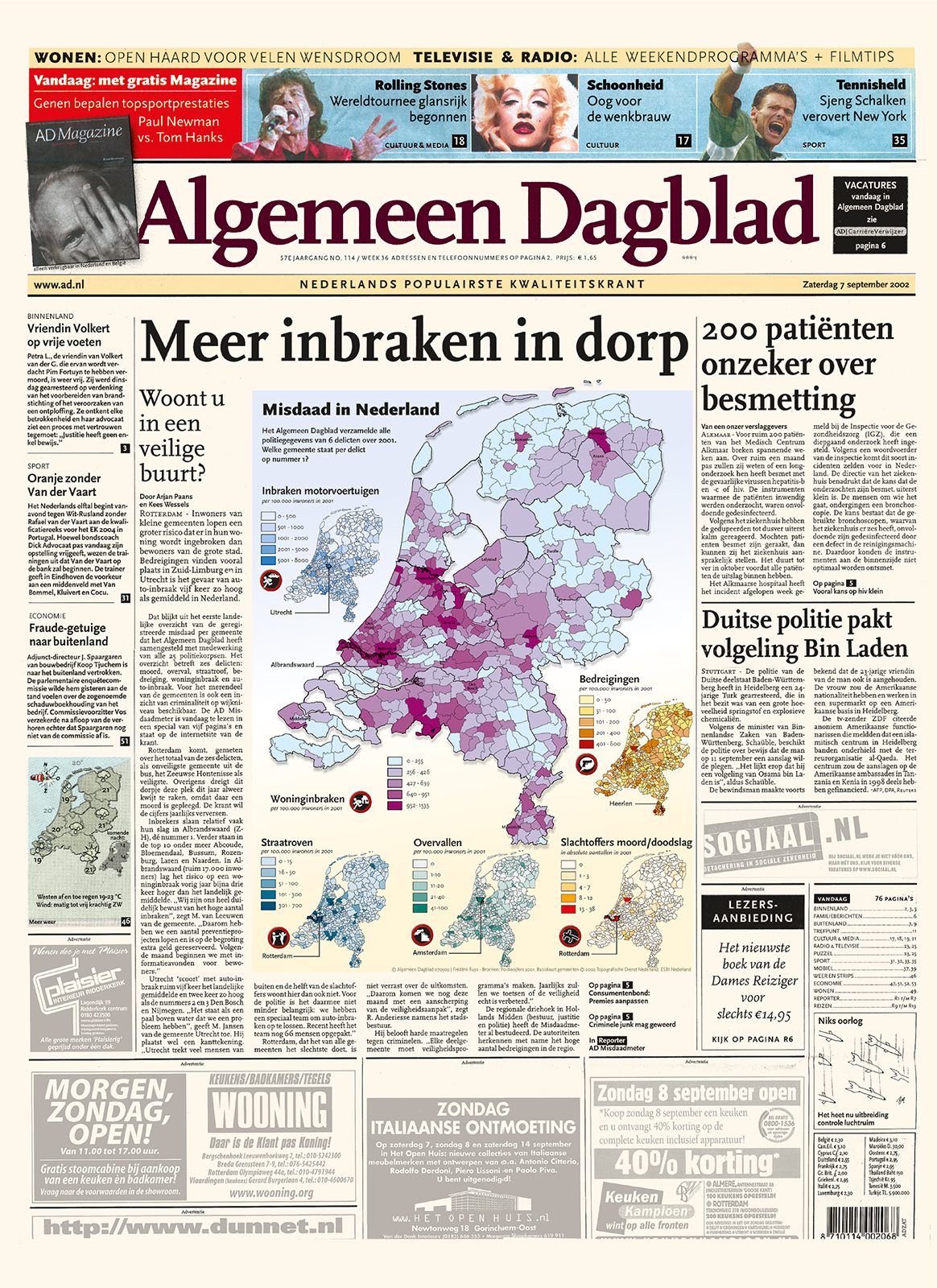
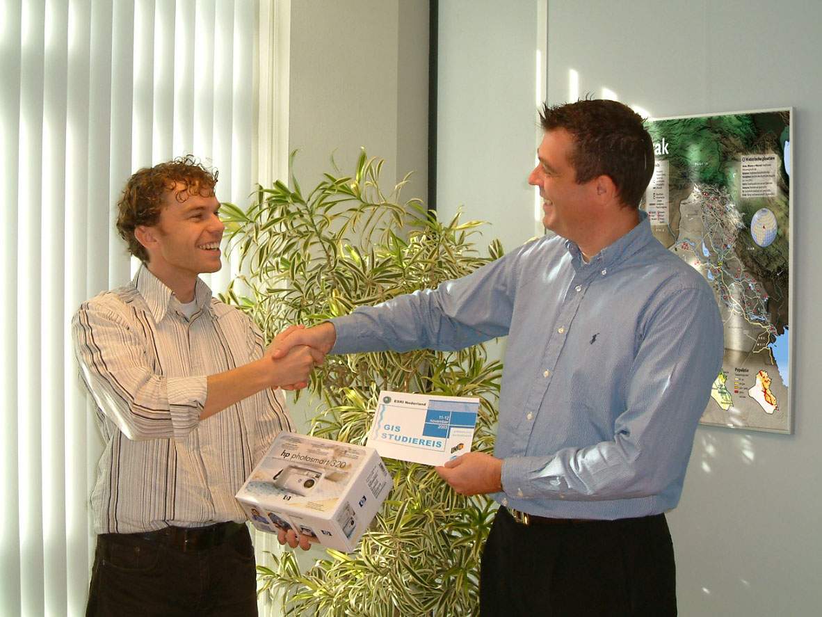
Op de GIS-conferentie 2002 in Rotterdam koos een vakjury de Misdaadkaart van Nederland (uit het Algemeen Dagblad) als winnaar van de MapGallery. Het jaar daarop koos de publieksjury van de GIS-conferentie de kaart van Afghanistan als winnaar van de MapGallery 2003. Deze maakte Frédérik in opdracht van De Groene Amsterdammer.
|
|
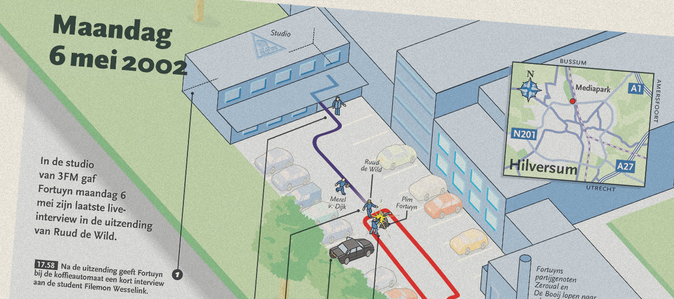 De moord op Pim Fortuyn was een aanslag van ongekende proporties die het politieke landschap voor goed zou veranderen.
Als infographicredacteur van het toenmalige Algemeen Dagblad ben ik de volgende dag meteen de getuigen gaan benaderen: of ze mee wilden werken aan een visuele reconstructie van de dramatische gebeurtenissen. Aanvankelijk reageerden zij erg terughoudend: het was immers nog geen 24 uur geleden gebeurd en het land verkeerde in shock.
 De infographicredactie van het Algemeen Dagblad viel bij de uitreiking van de prestigieuze Malofiej Award in het Spaanse Pamplona in de prijzen. De infographic, over de aanslagen op het WTC in New York, kreeg in de categorie ‘breaking news‘ zilver. De Nederlandse redactie moest het afleggen tegen – hoe kan het ook anders – de redactie van The New York Times. Die won goud.
De serie illustraties, die stapsgewijs de gebeurtenissen op 11 september weergeven, zijn gemaakt door Thijs Unger, Frédérik Ruys en Ramses Reijerman.
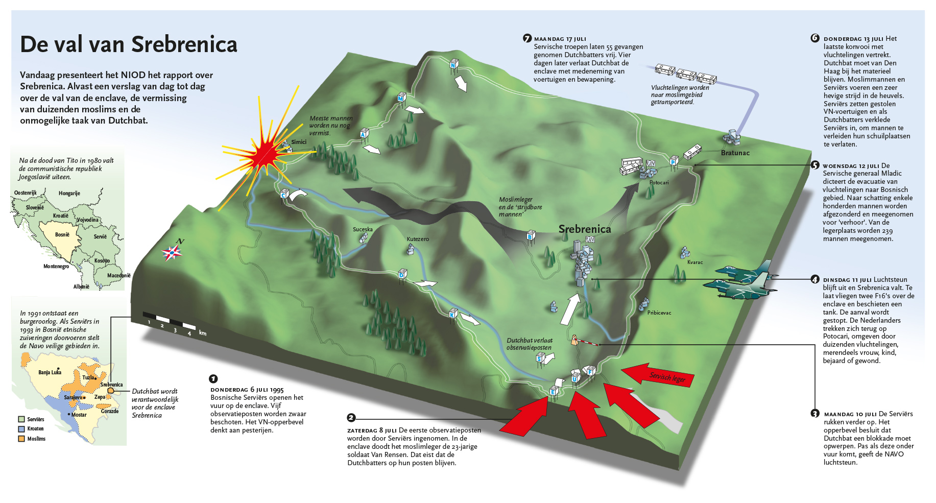
Naar aanleiding van de presentatie van het Srebrenica-rapport van het NIOD op 10 april 2002, maakte Frederik op de infographicredactie van het Algemeen Dagblad een reconstructie van de dramatische gebeurtenissen in juli 1995.
Download PDF.
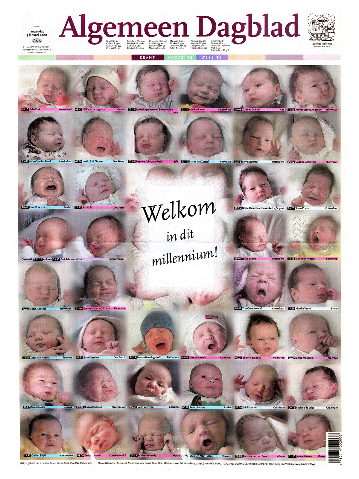
 In 2001 sleepte het Algemeen Dagblad tweemaal een prijs in de wacht. De één voor de beste voorpagina (met de collage die ik maakte van alle ‘millenniumbabies’).
De ander voor de beste krant (de uitgave van 1 april 2000, die van begin tot eind door Nederlandse en Belgische striptekenaars was geillustreerd en waarvoor ik de coördinatie mocht verzorgen).
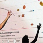
Frédérik Ruys verzorgt inspiratiesessies en... ››
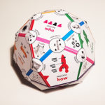
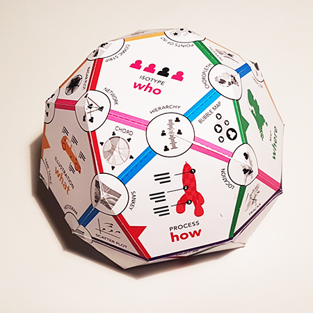
How to decide which visualization fits your needs? This polyhedron... ››