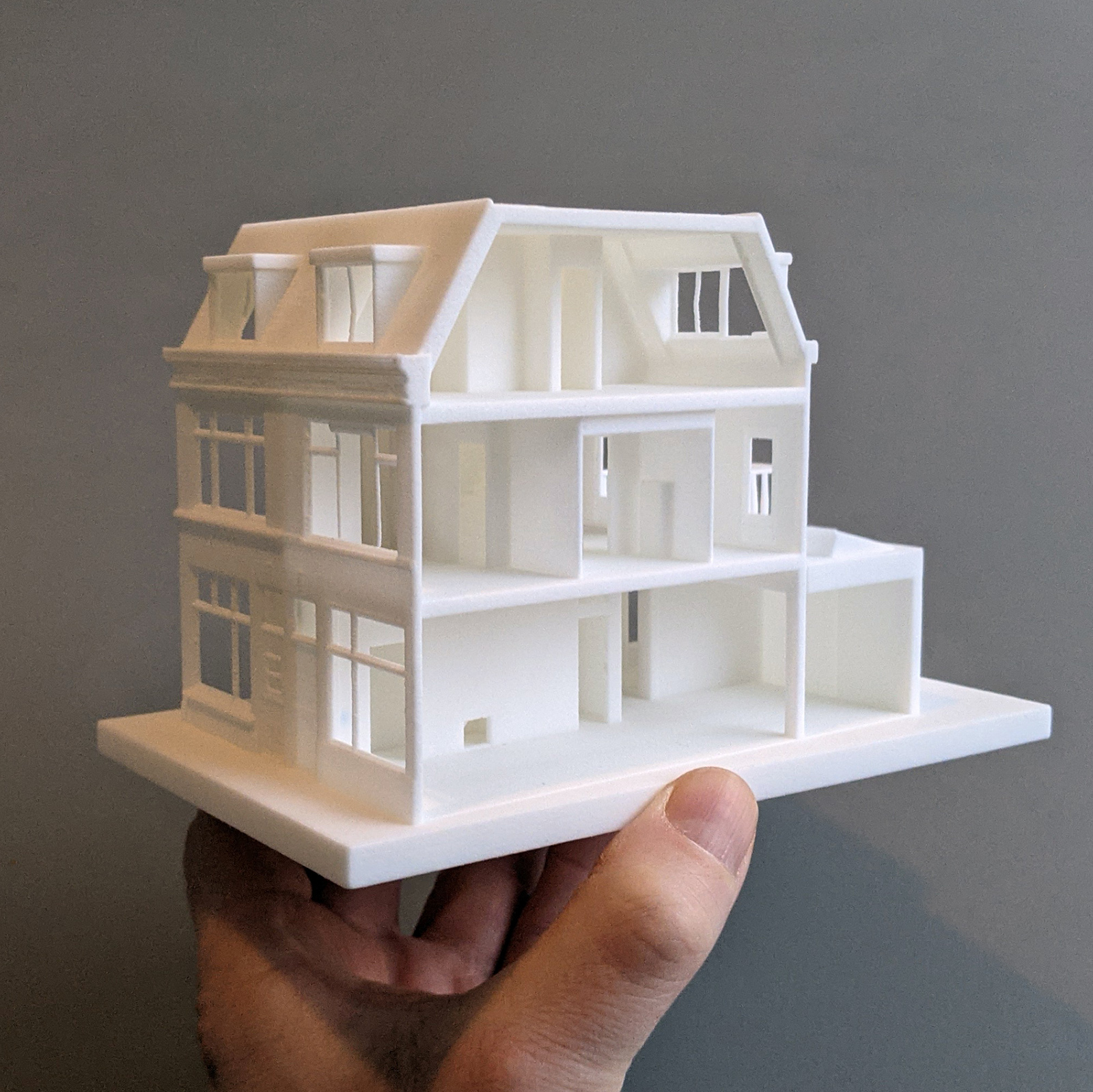
3D print of home / office
Experimenting with the new STL-export in SketchupPro 2021.


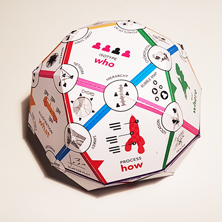
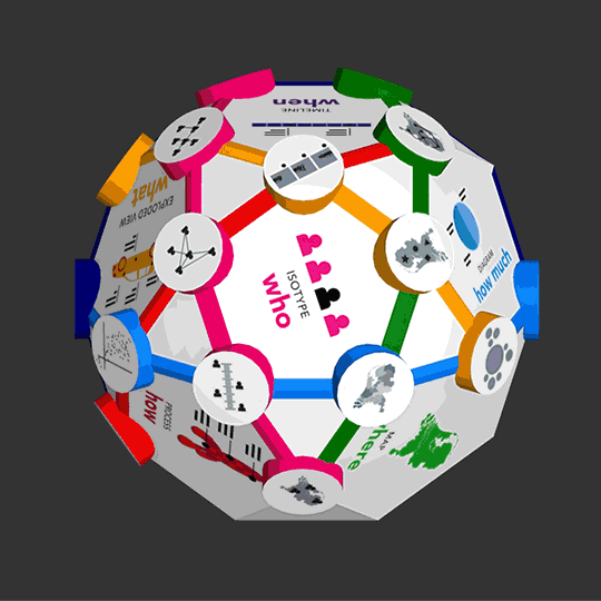
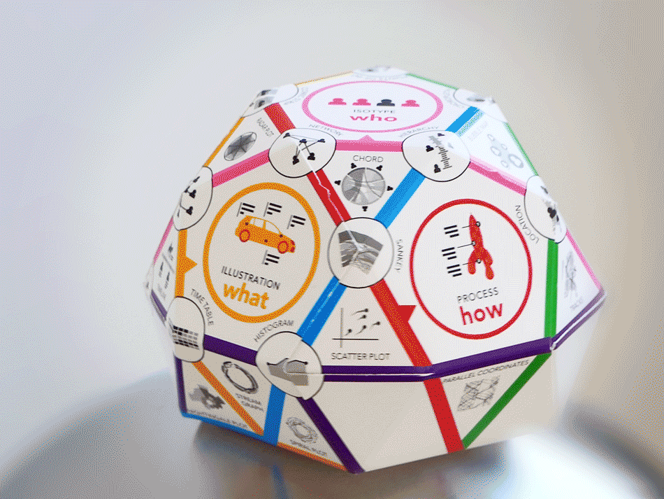
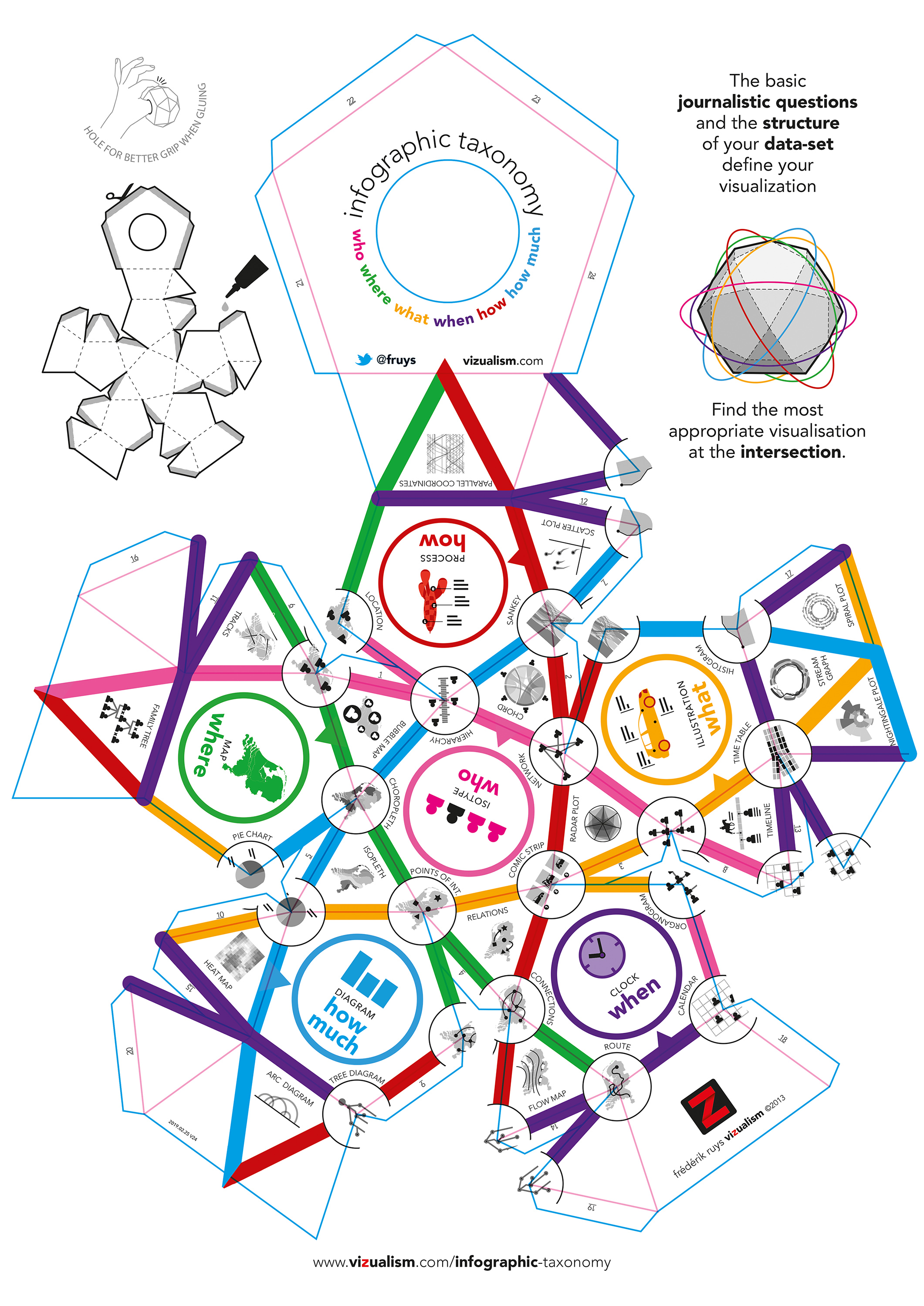
It can be hard to find the most appropriate visualization method. But the basic journalistic questions and the structure of your data-set already define your visualization. To help you find it, I build this taxonomy.
PentagonWithin each pentagon you’ll find one of the journalistic questions:
IntersectionCombine two colors, like WHO and HOW MUCH, to find at the intersection the most appropriate visualization. In this case: the hierarchy of persons (or objects) based on values. TriangleWhen combining three questions you’ll find the visualization within the vertices in the corresponding color. So the combination of WHO + WHERE + WHEN results in ‘Tracks’ of people (or objects) through space and time. Glue your own!Have your own Infographic Taxonomy-cube (which I constructed using a polyhedron: a icosidodecahedron) by sending me an e-mail f.ruys @ vizualism.com. No need to use your pair of scissors; you’ll get a pre-folded and laser cutted plan to glue your own Infographic Taxonomy. Design: Frederik Ruys. |
|