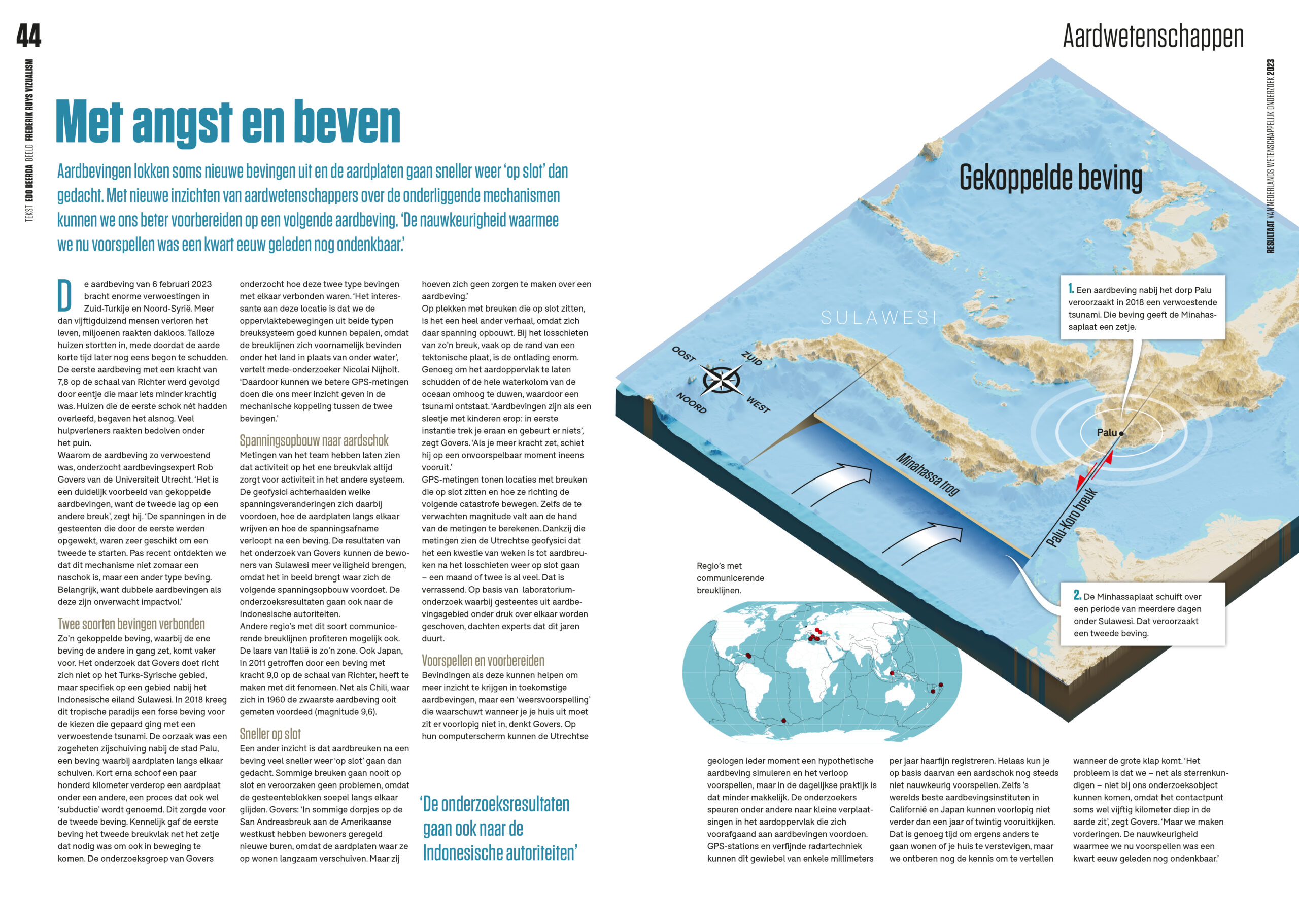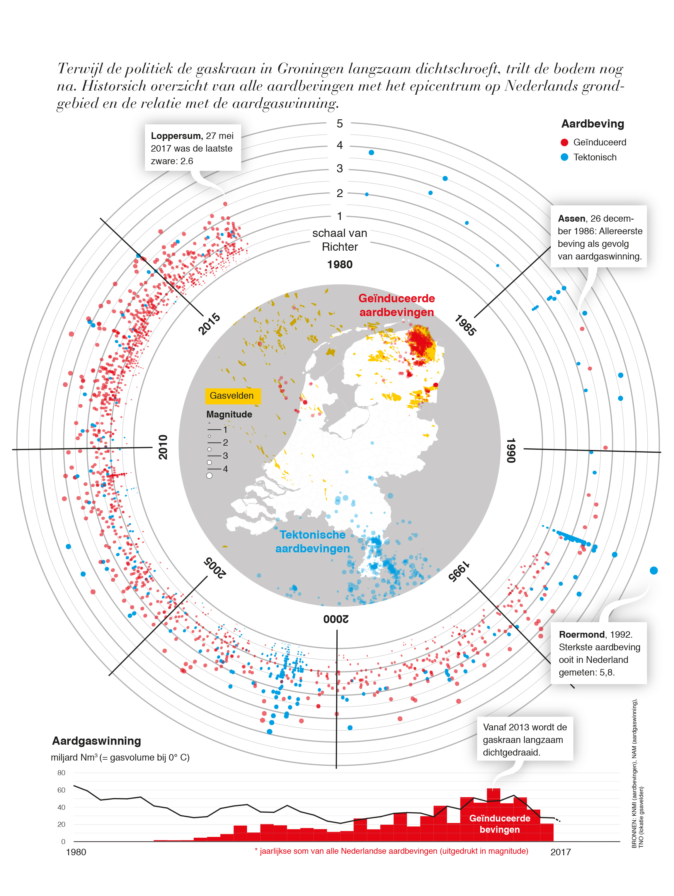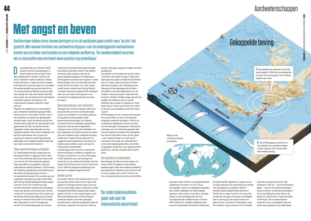
Onderzoek naar gekoppelde aardbevingen
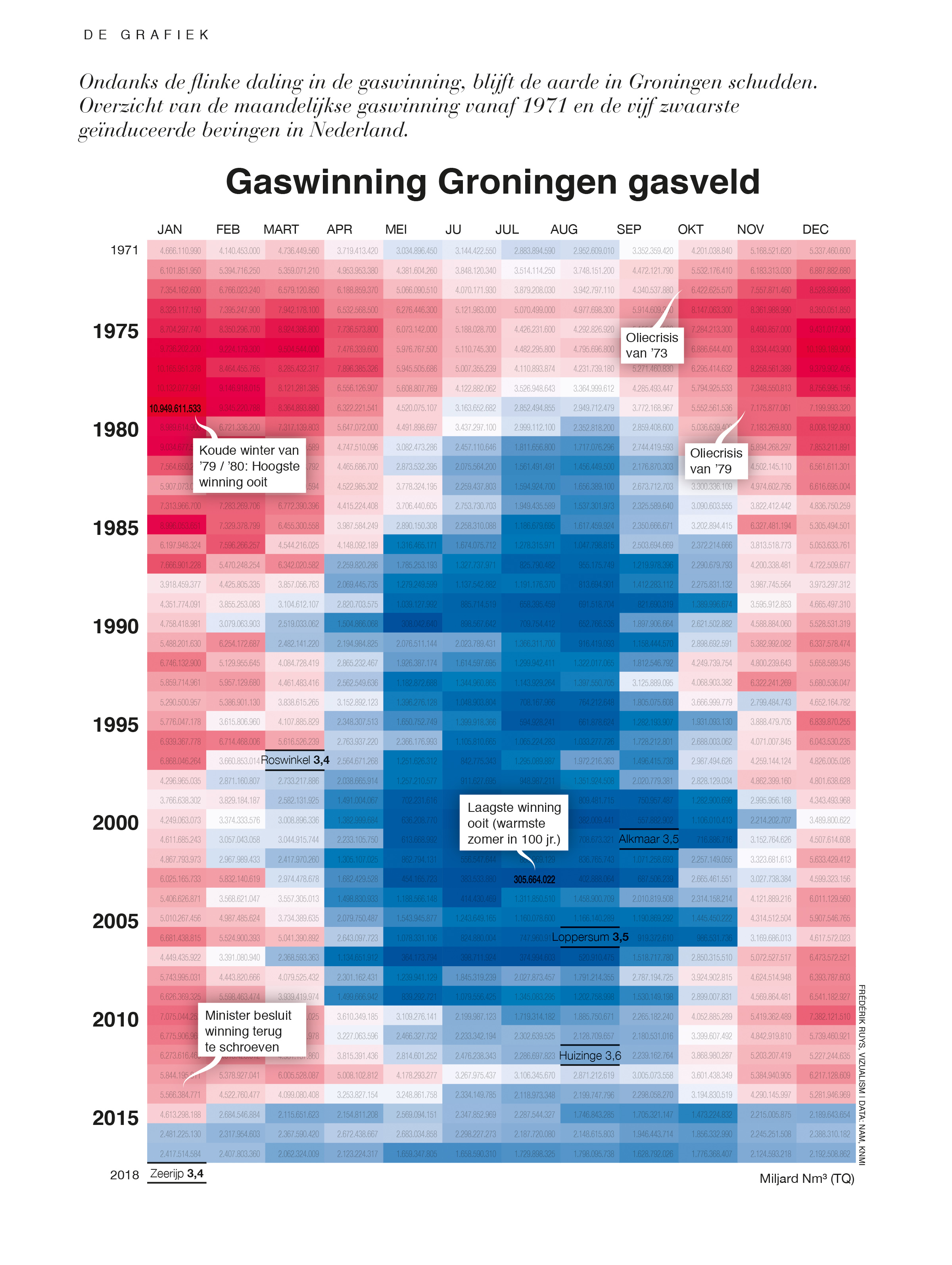
Aardbevingen lokken soms nieuwe bevingen uit. Met nieuwe inzichten over de onderliggende mechanismen kunnen we ons beter voorbereiden op een volgende aardbeving.
Meer info




|
|
|
|
|
|
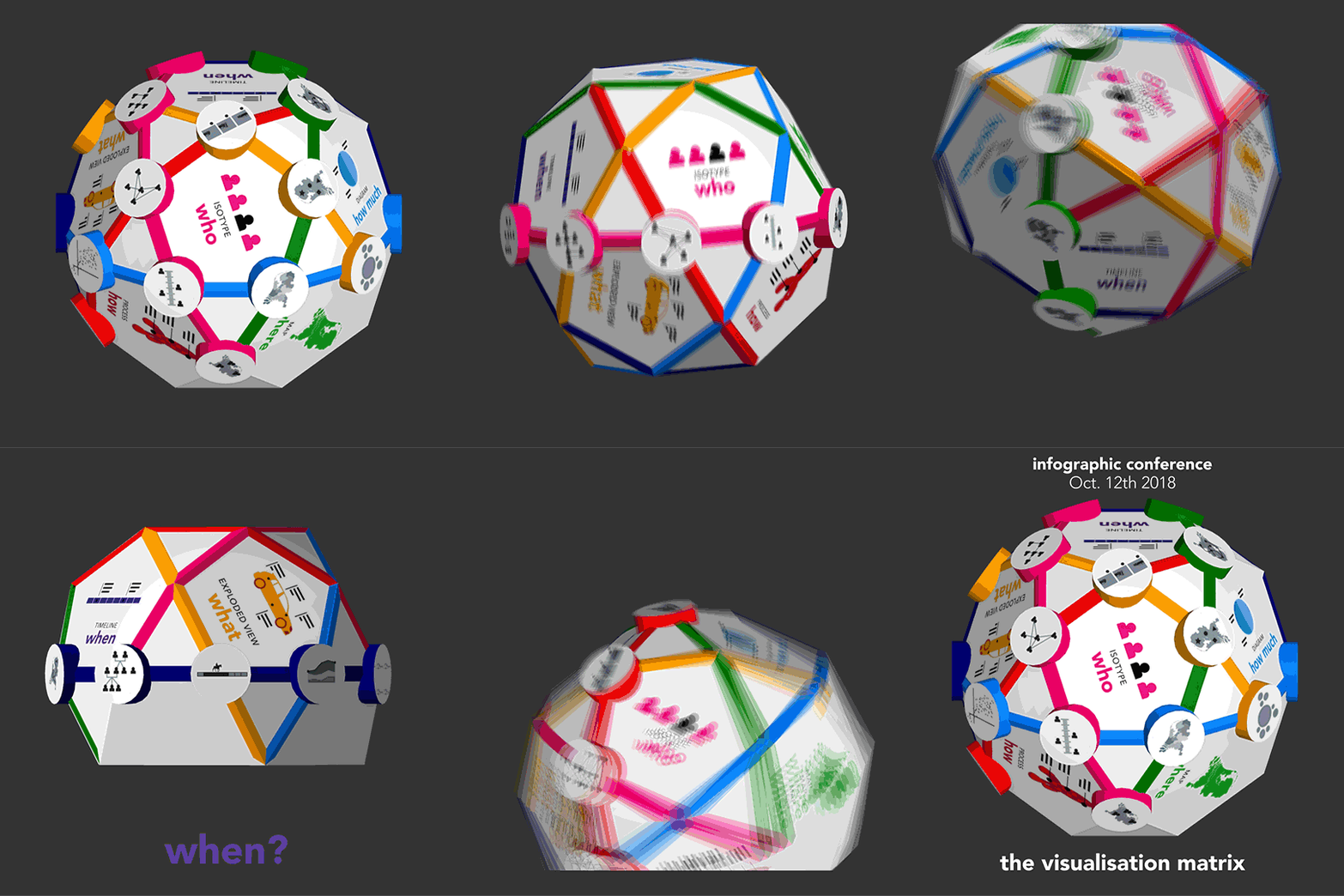
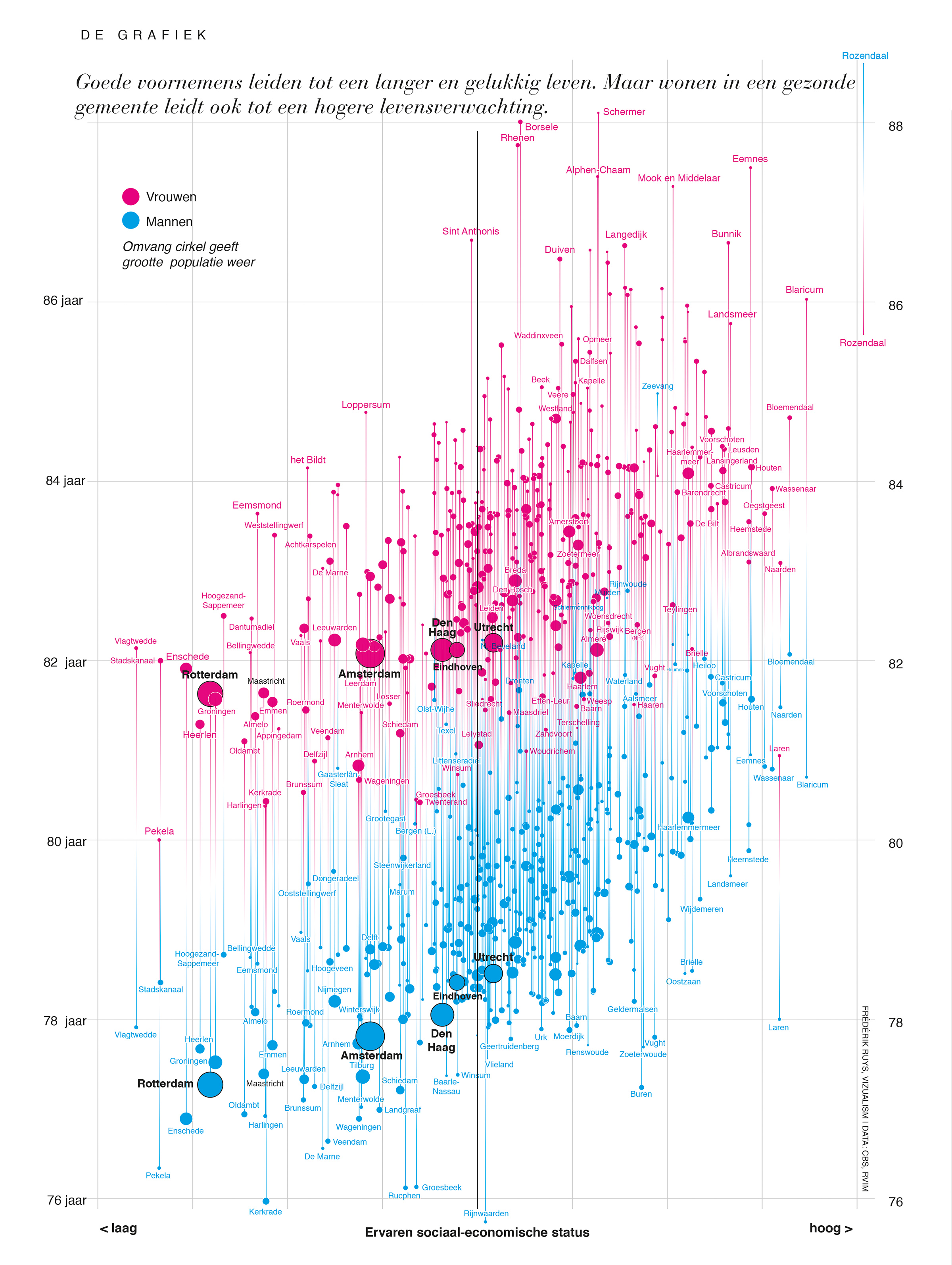
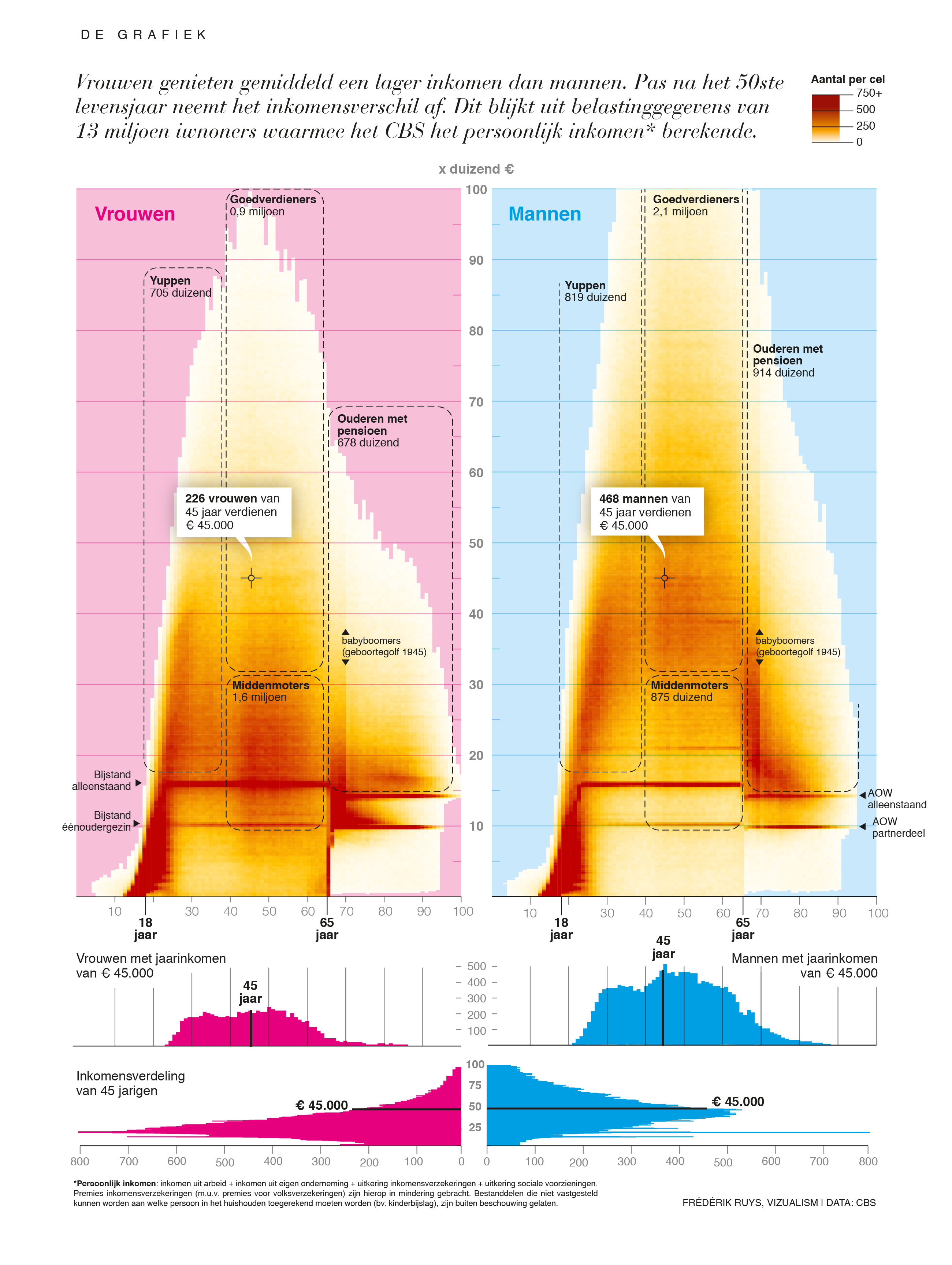
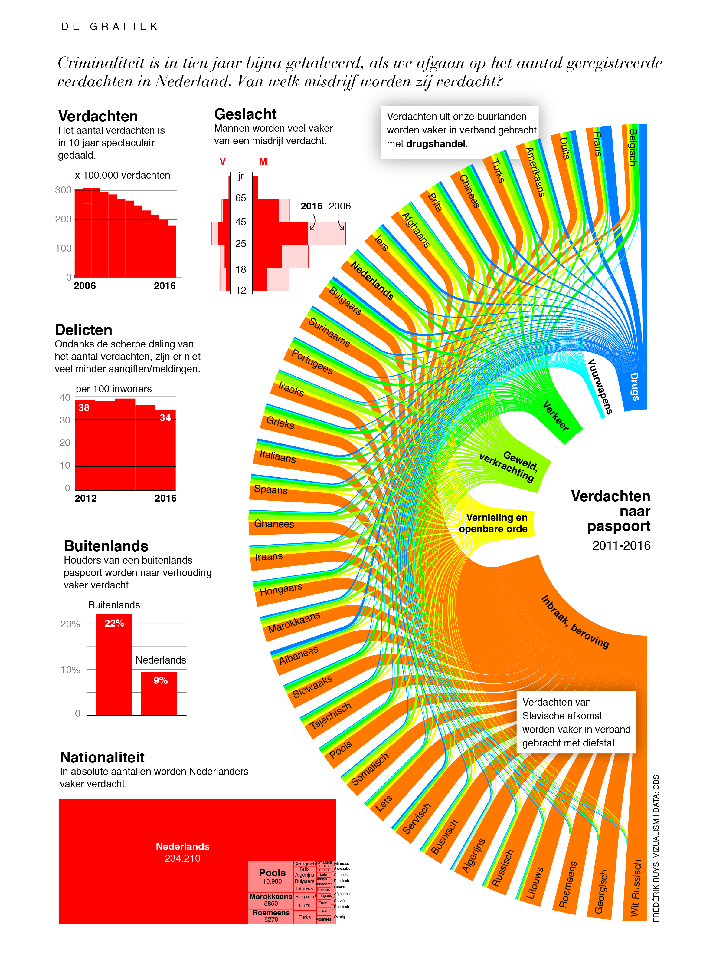
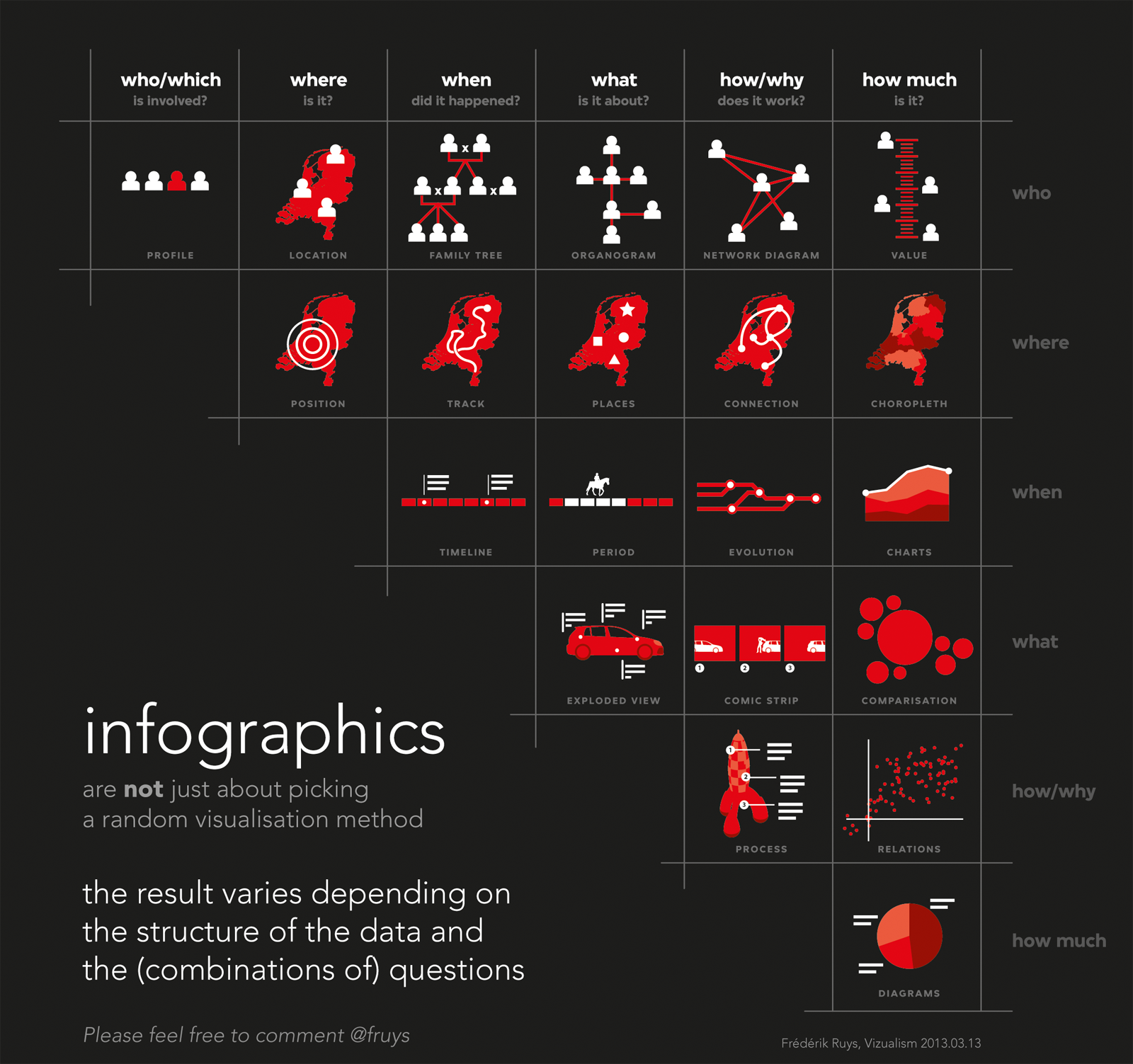
Often it’s hard to find the most appropriate visualization method. But by knowing the structure of the data-set and defining the basic journalistic questions, it becomes easier when you use the matrix above: form follows function. I use it during my workshops and in my talks with journalists and designers.
I’ve also been working on a three dimensional, more compact version of the matrix, where each intersection reveals the visual solution based on the combination of questions. This polyhedron is based on a icosidodecahedron.
 Back in 2013, on my way to Malofiej Infographic Summit in Pamplona judiging the annual awards, I worked out some ideas about a taxonomy which resulted in the matrix above.
Thanks to a tweet of Maarten Lambrechts, the taxonomy drew a lot of new attention in 2017.