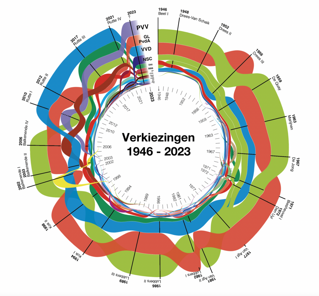


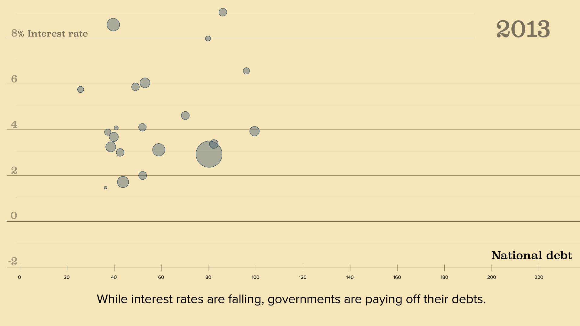


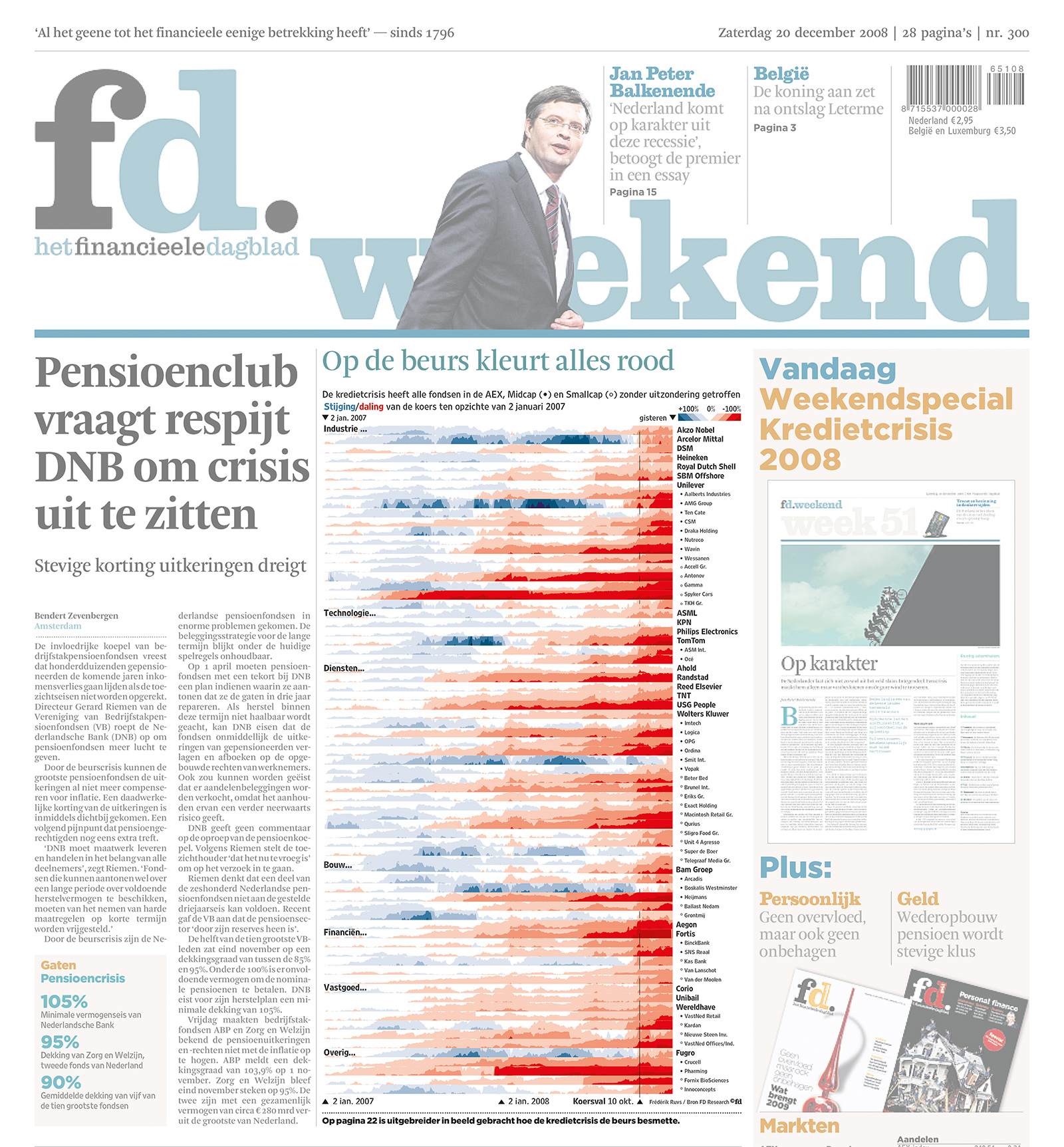
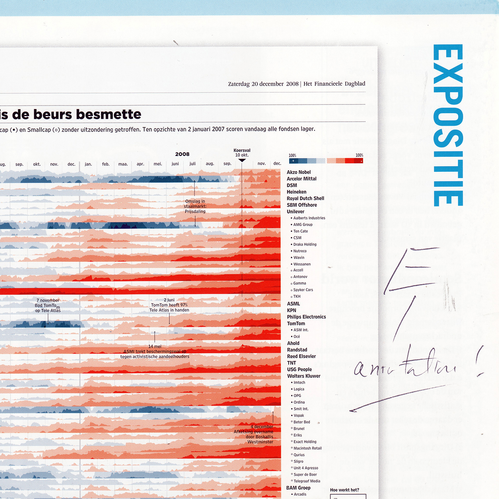
Horizonchart about the crisis of credits 2007 – 2008
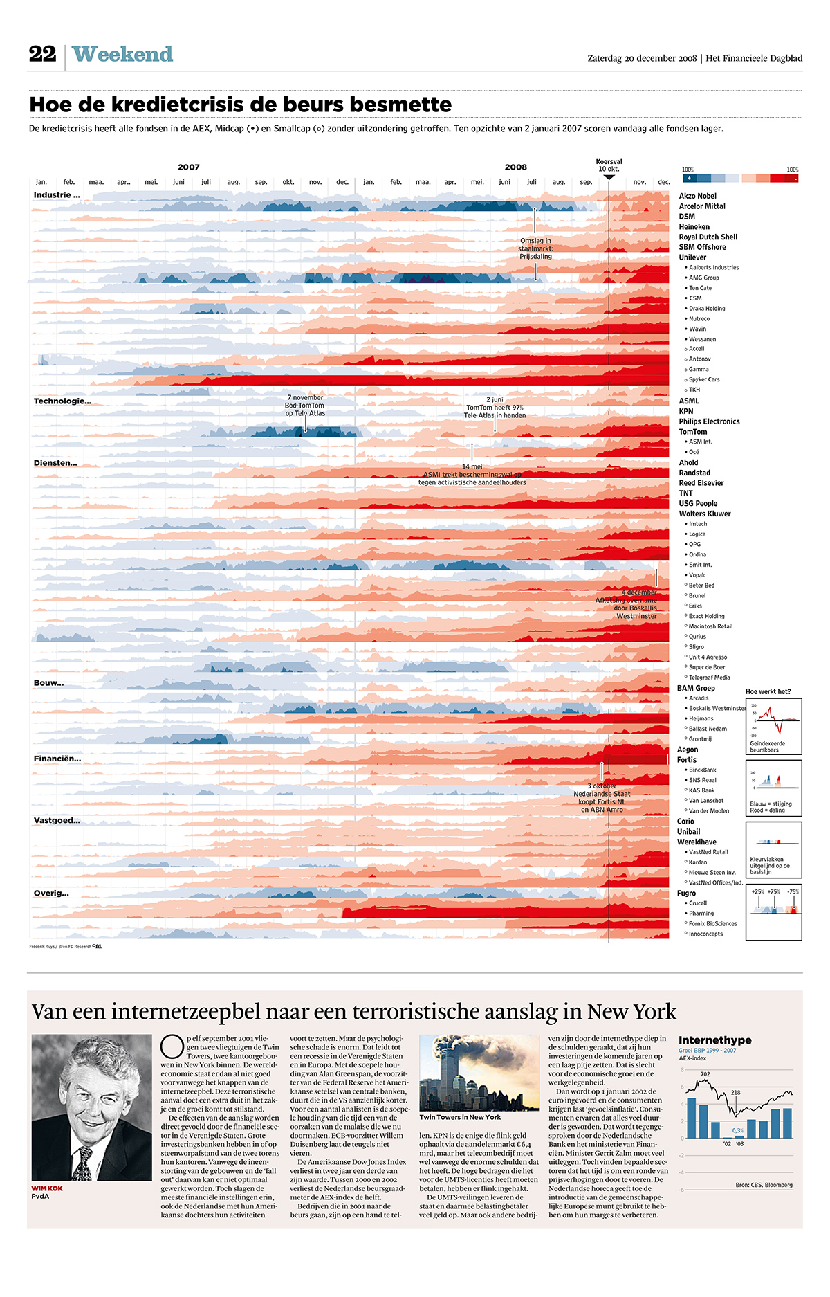 The horizon chart appeared to most effective way to visualize the dropping of stocks on the Amsterdam Exchange from January 2007 to December 2008. All funds – without exception – turned red. As the visualisation method needed some explanation, I made the animation above. The annotations, highlighting crucial moments in the financial crisis, were crucial to make the datavisualisation also informative.
Designed by Frédérik Ruys, published in Het Financieele Dagblad on december 20th, 2008.
- Published on frontpage Financieele Dagblad (without annotations, upon art director’s request)
- Awarded by Infographic Jaarpijs (2009)
- Signed by Tufte, pleading for even more annotations (2016)