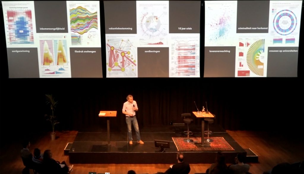
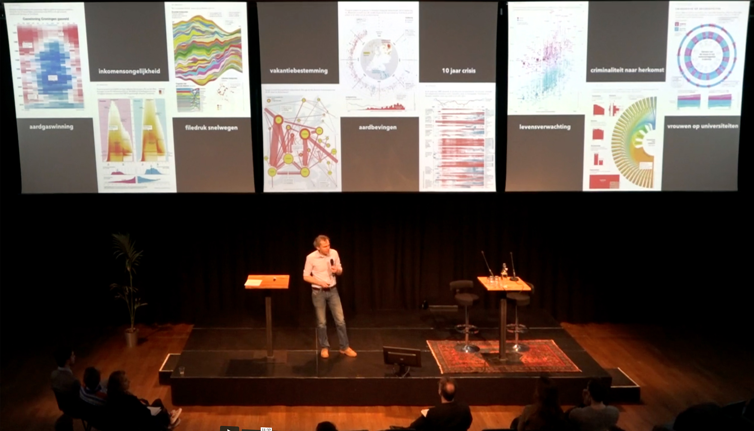
Design Matters: Het Nieuwe Nieuws
Talk at Amsterdam
Pakhuis de Zwijger/

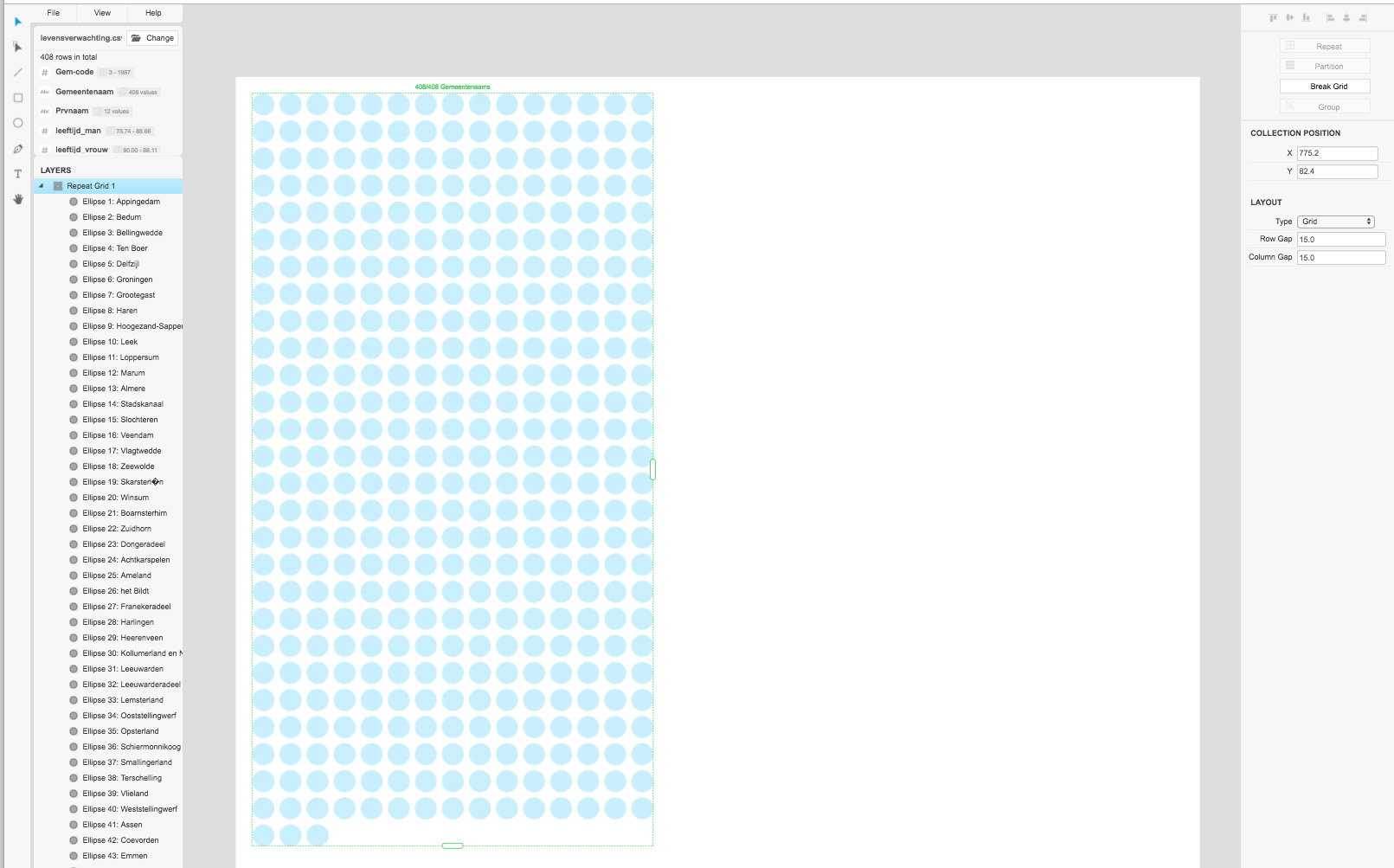
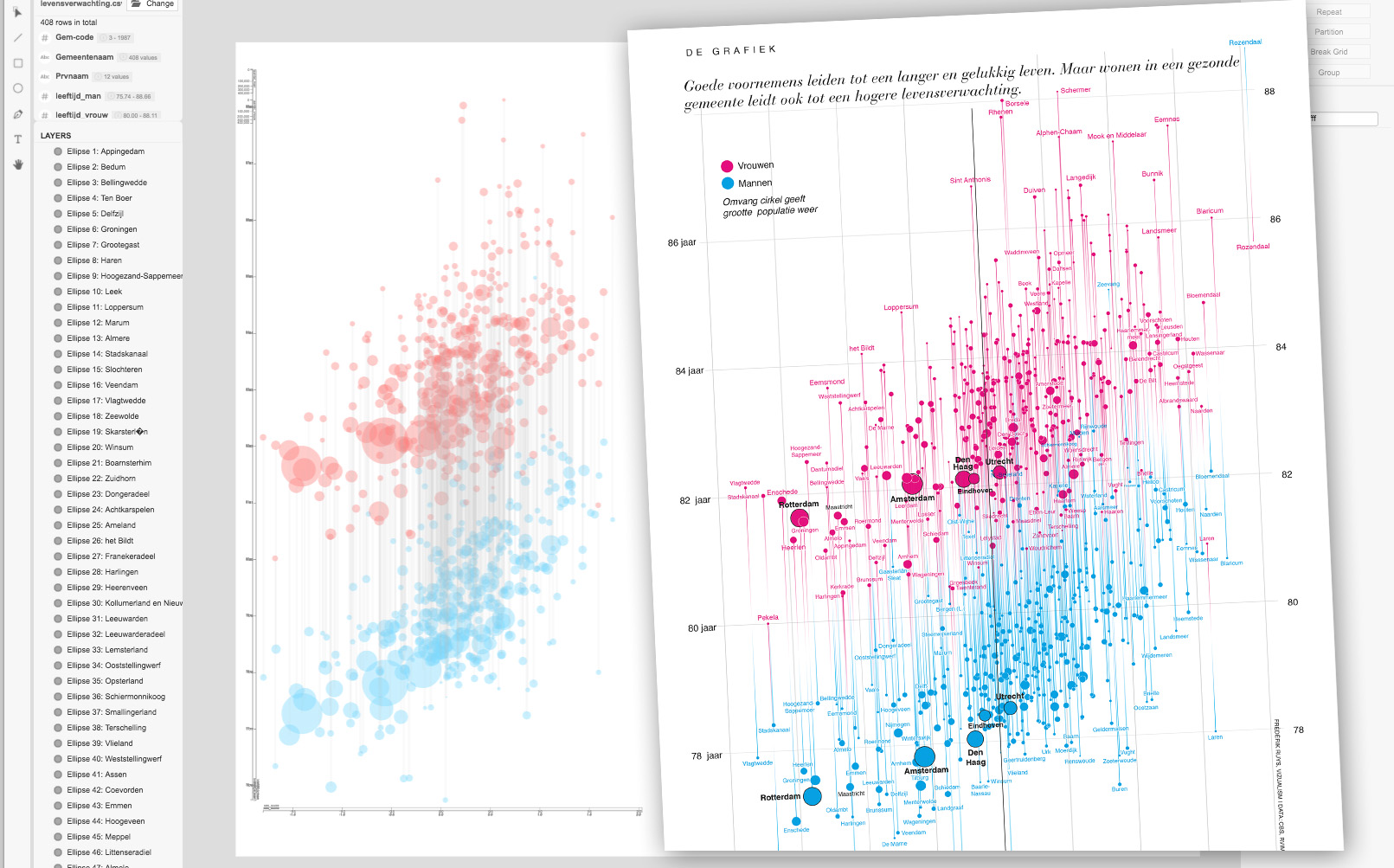
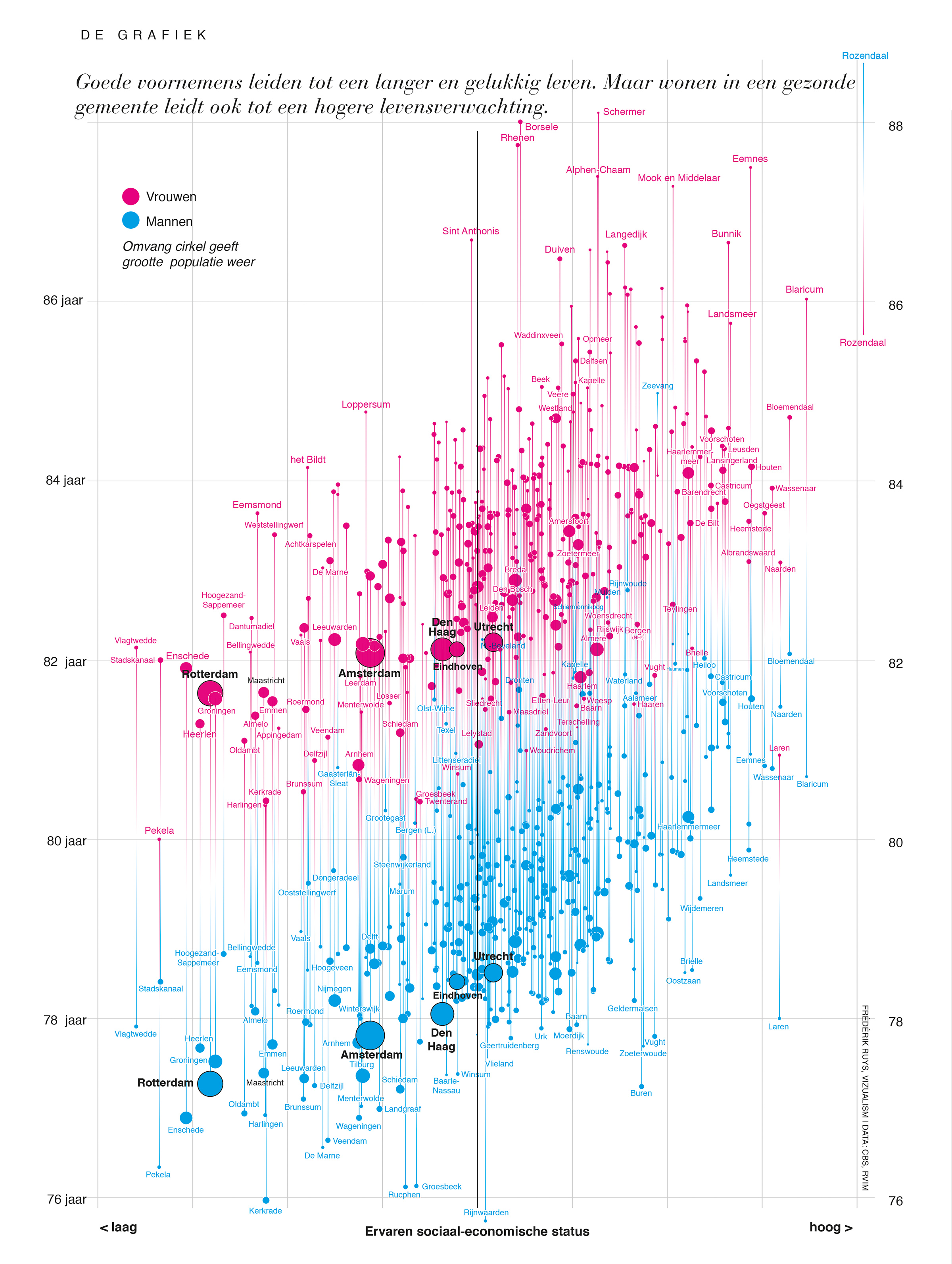
Reconstructing an infographic on life expectancy in Dutch cities (previously published in Vrij Nederland) using this awesome tool: Data Illustrator, a great research collaboration between Adobe Systems Inc. and Georgia Institute of Technology.
Downloads:
|
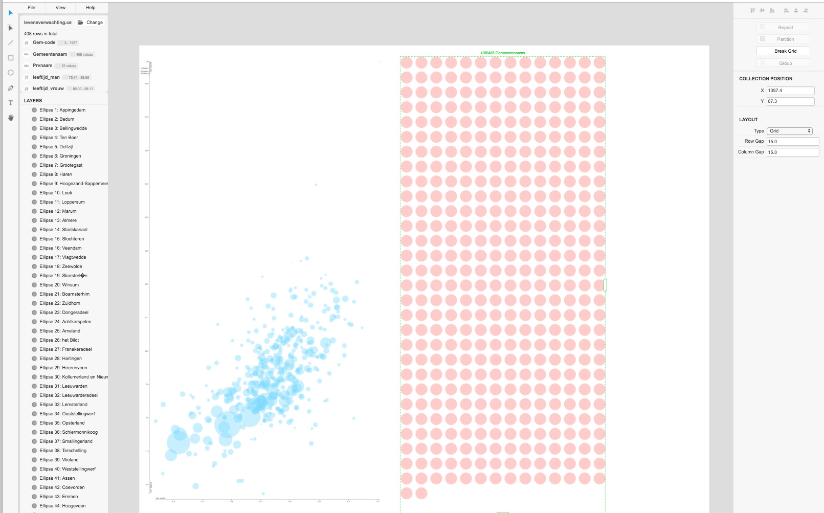
Load the csv-file. Draw one single circle, color it and click ‘repeat’. Assign ‘gemeente’ (= municipality). Enlarge the area to show all 408 municipalities. |
|
|
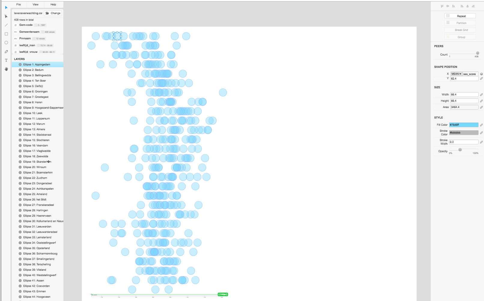
Press ‘break grid’ and click any circle. Define the x-position (social status) by assigning ‘SES-score’ from pull down menu. |
|
| Define the y-position (= age) by assigning ‘leeftijd_man’. | 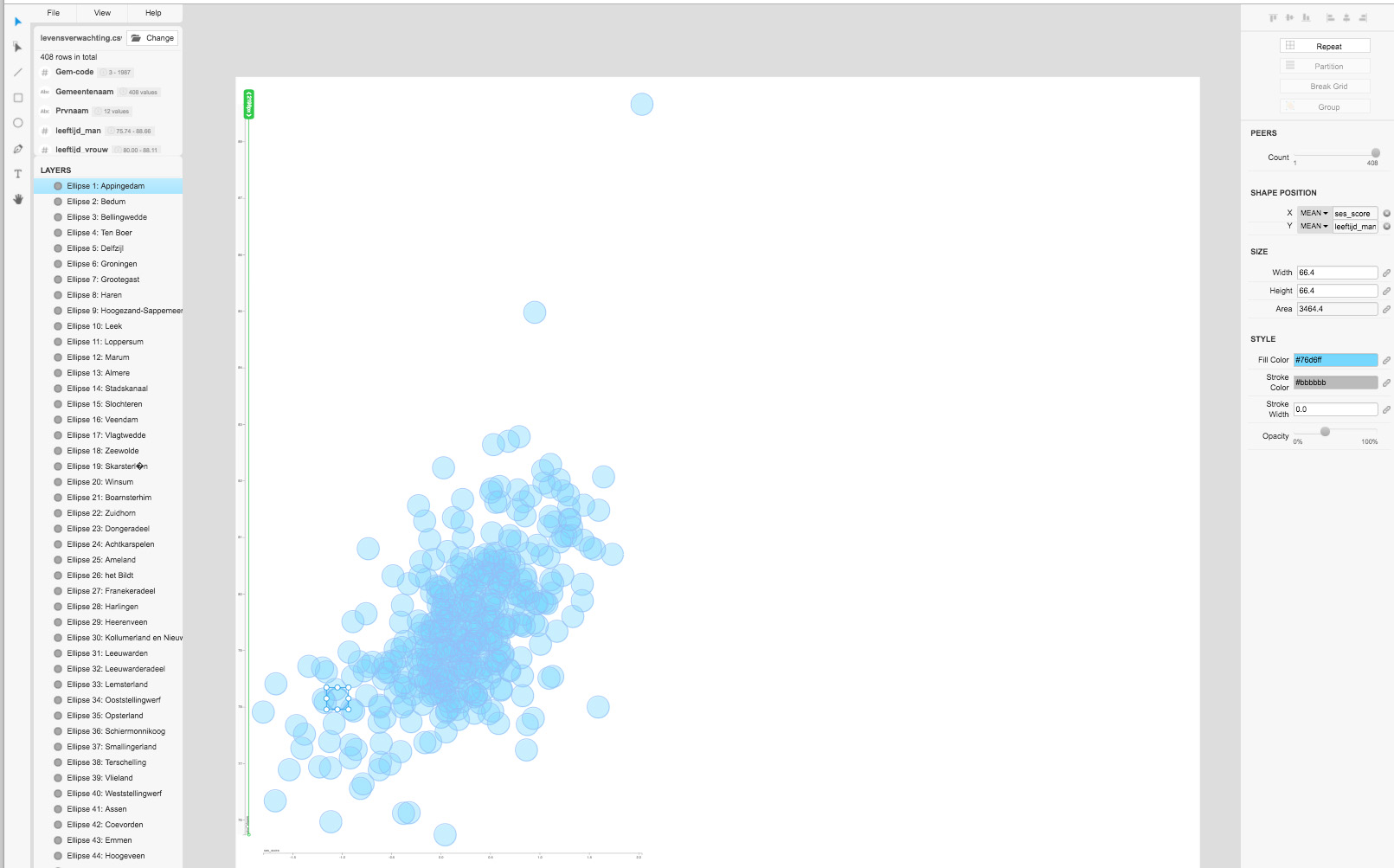
|
| Define the size (= number of men per municipality) by assigning ‘aantal_mannen’. | 
|
|
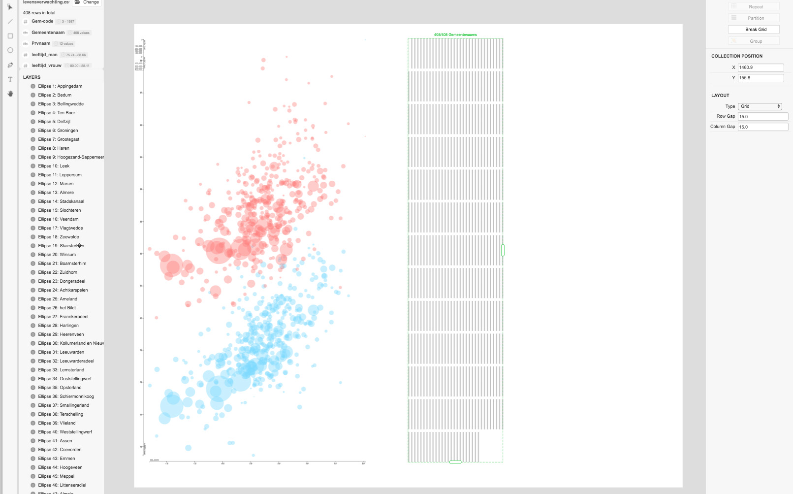
Repeat this for women: Draw single circle, color it and click ‘repeat’. Assign ‘gemeente’ and reveal all 408 circles. |
|
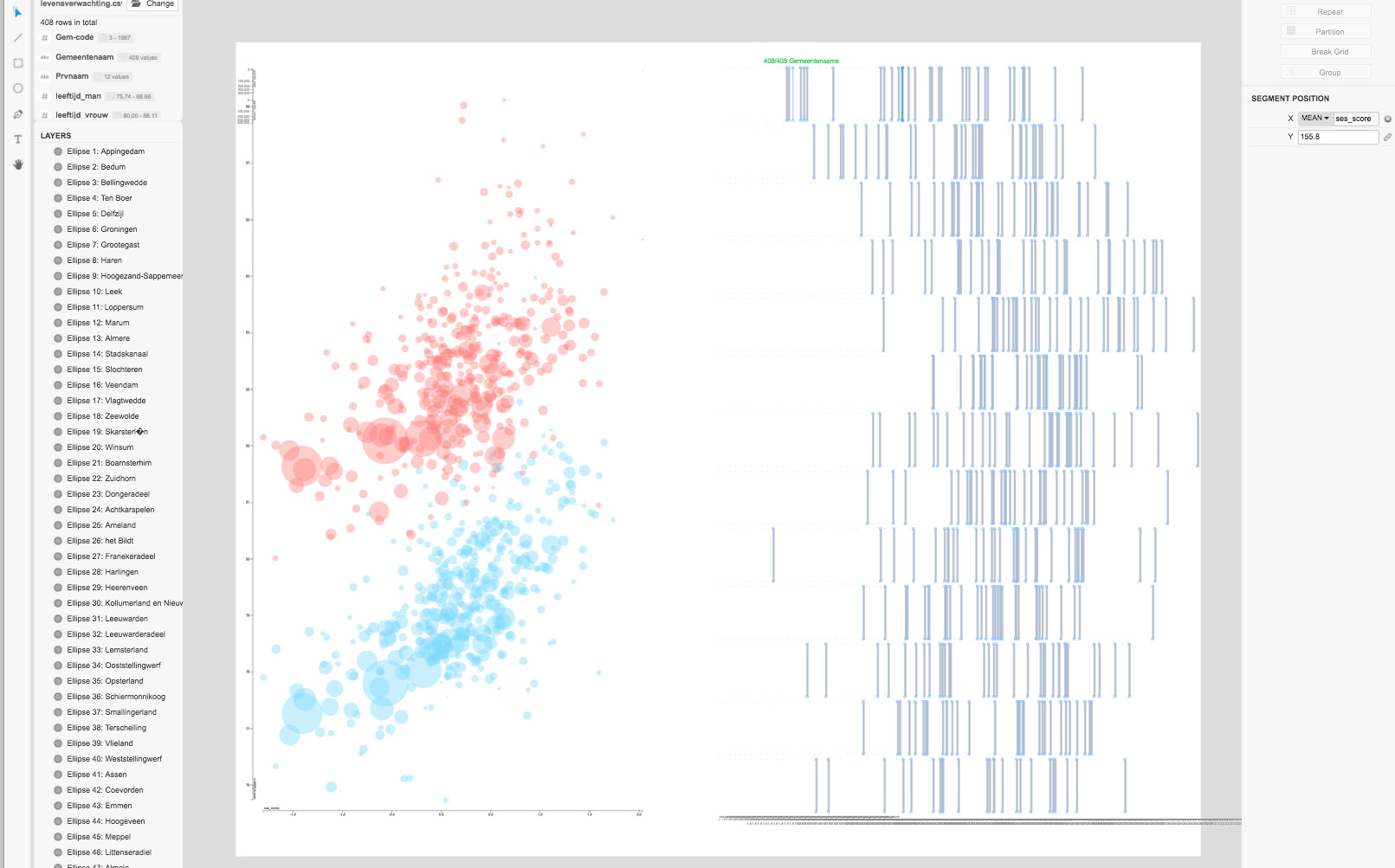
| Define the x-position (= social status) by assigning ‘SES-score’ from pull down menu. | 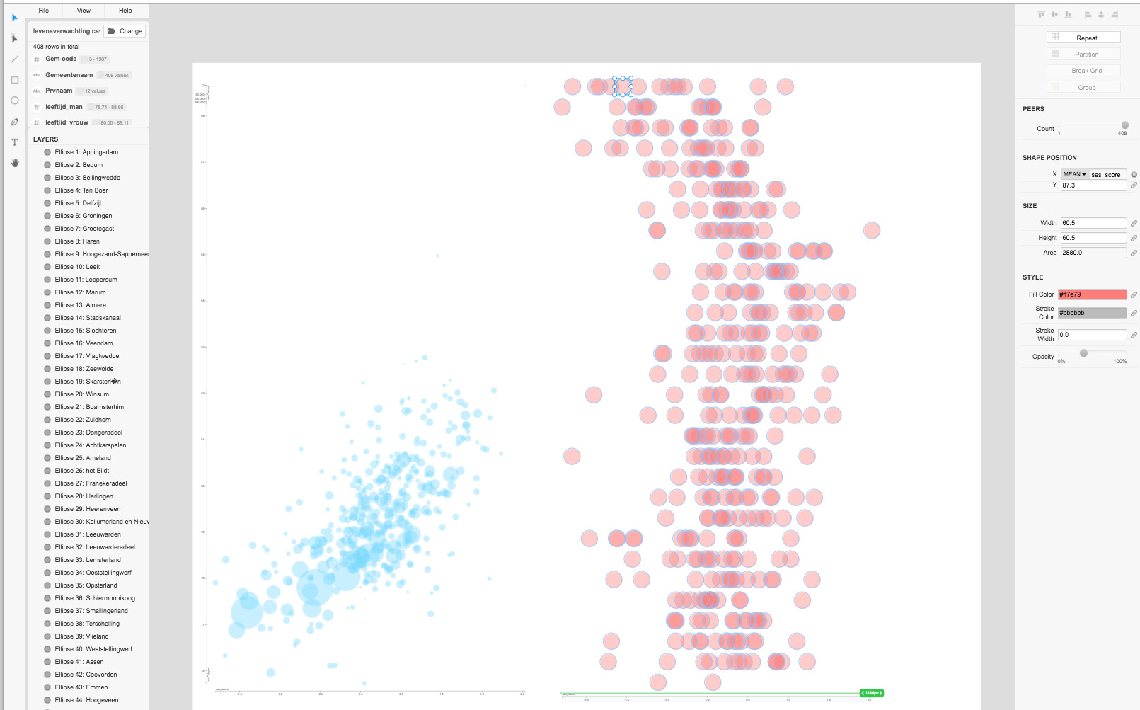
|
| Define the y-position (= age) by assigning ‘leeftijd_vrouw’. | 
|
| Define the size (= number of women per municipality) by assigning ‘aantal_vrouwen’. | 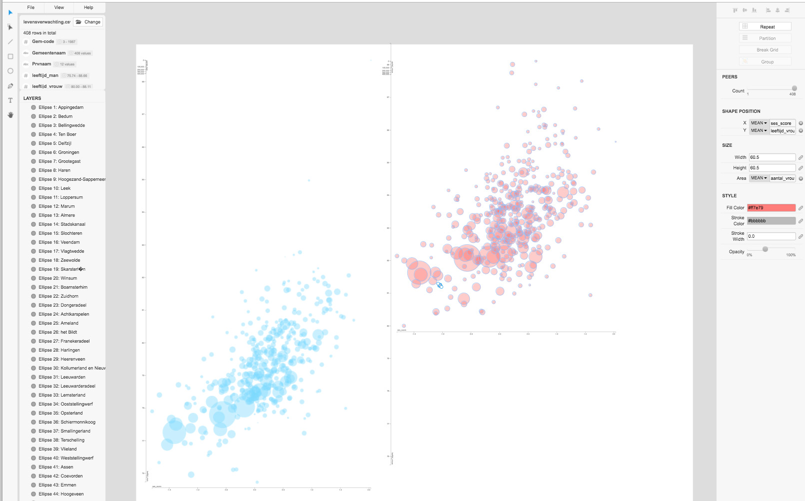
|
| Move visualization on top of each other. | 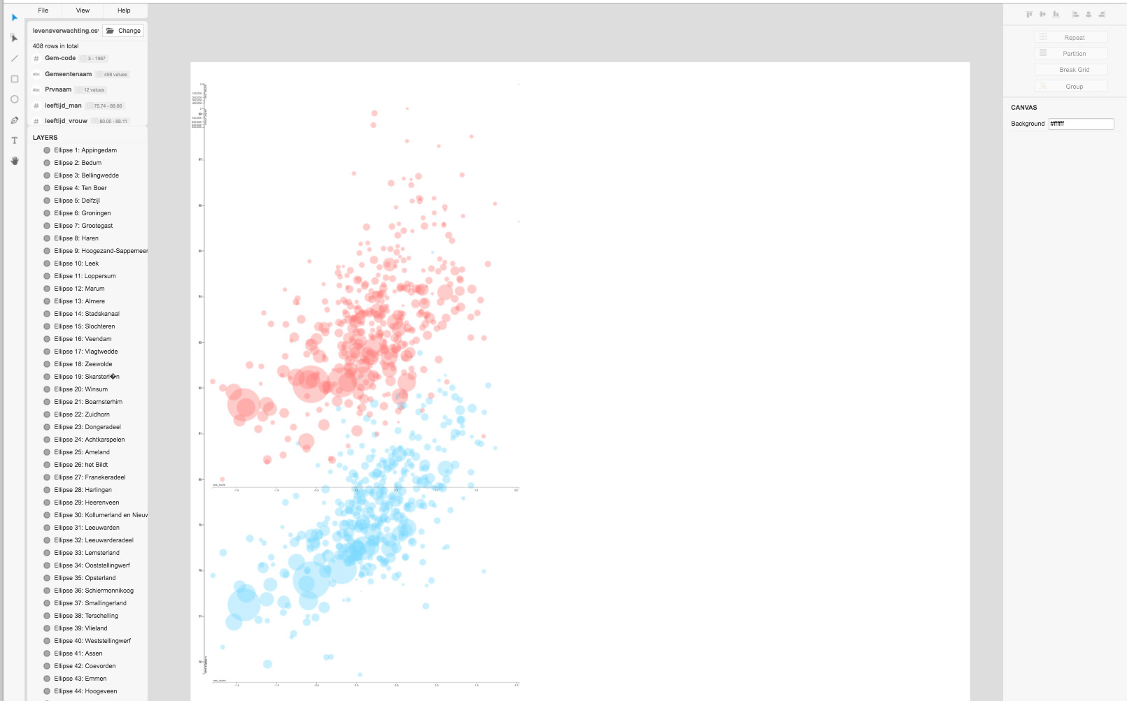
|
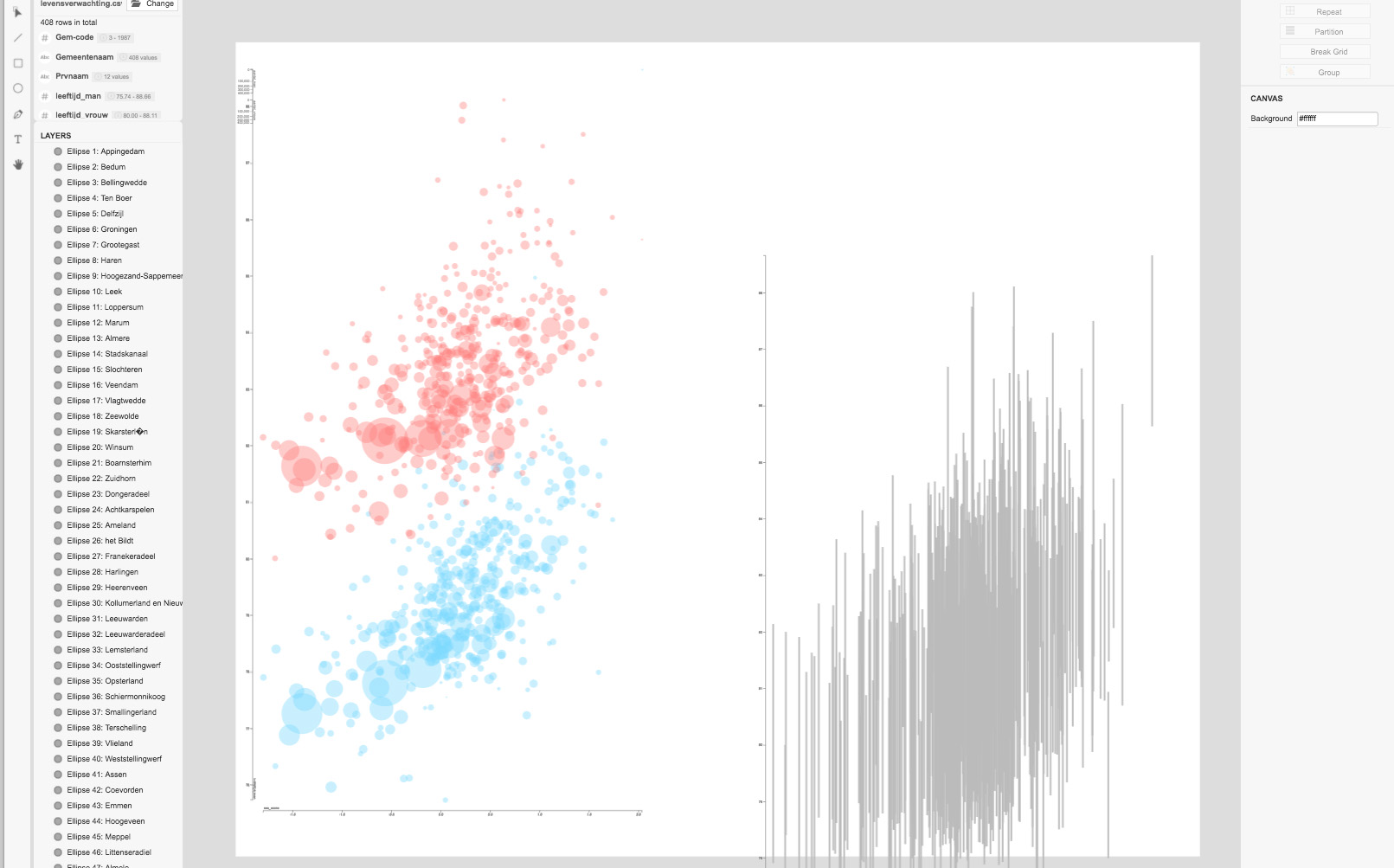
| Draw a single black line. | 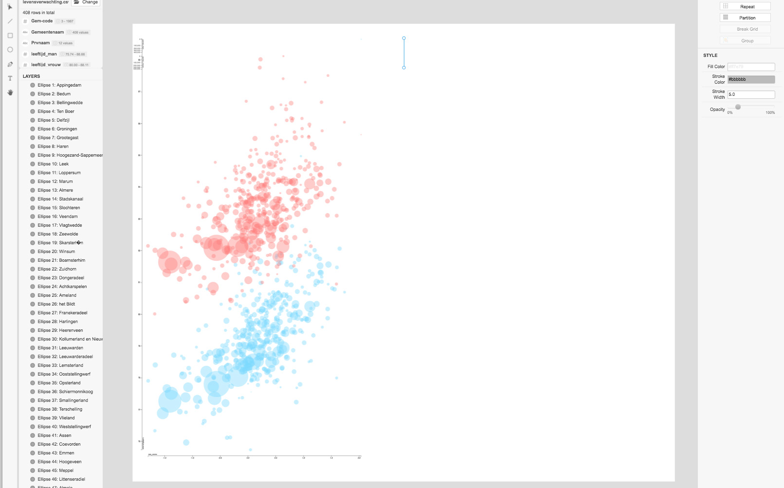
|
|
Click ‘repeat’. Assign ‘gemeente’ (= municipality) and enlarge the area to show all 408 municipalities. |
|
|
Select single line and define X-position. Assign ‘SES-score’. |
|
|
Select top anchor point and assign ‘leeftijd_vrouw’ to the y-position.
Select bottom anchor point and assign ‘leeftijd_man’ to the y-position. |
|
| Change opacity of connecting lines… | 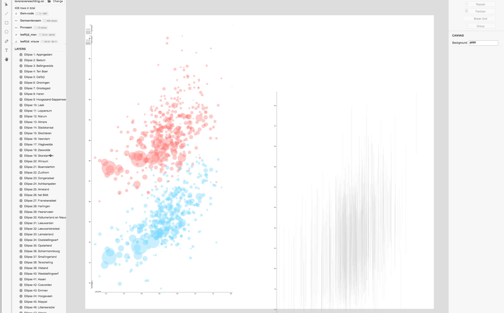
|
|
… and align to previous chart.
The original infographic was published in 2017 in Vrij Nederland and took me several hours to complete in Illustrator. |
|


 Step by step tutorial
 Step by step tutorial


