

2020_02_04_Lausanne_low
Download PDF
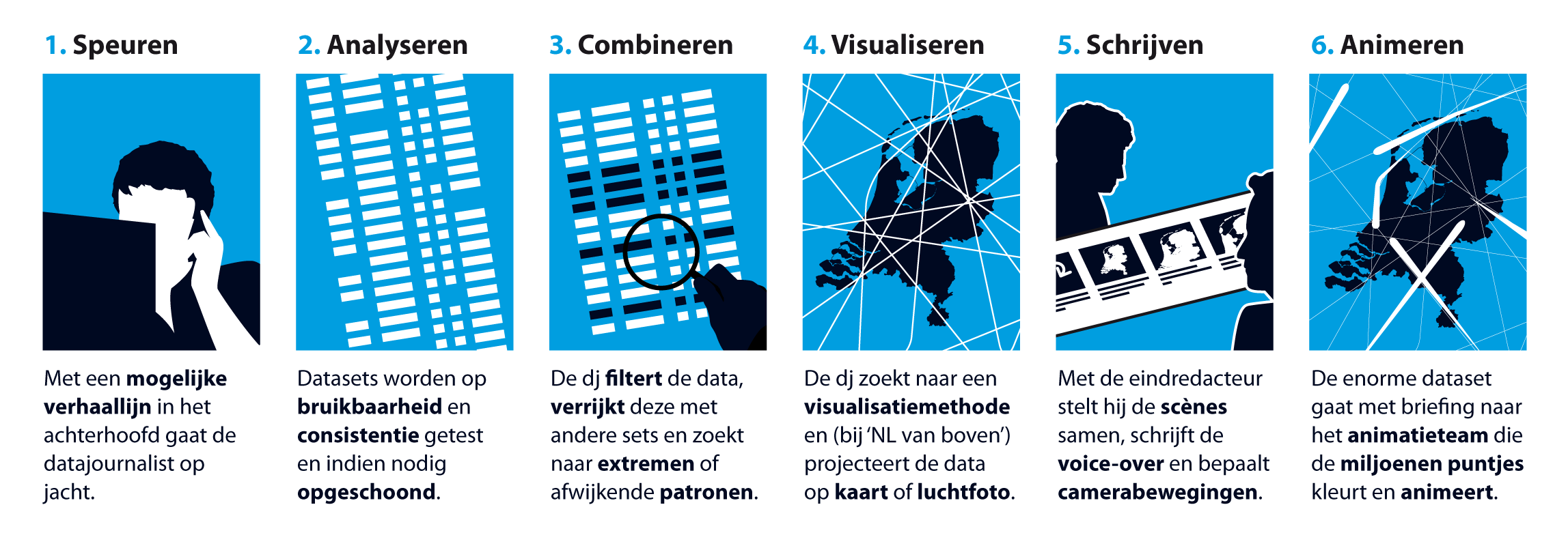
Data Journalist process
Download English version | Nederlandse versie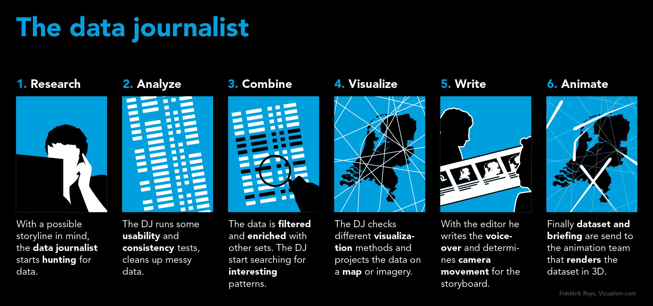
NL from Above 1More animations |
NL from Above 2More animations |
Invisible NLMore animations |
Invisible Netherlands
Eindredacteur/regisseur Geert Rozinga en datajournalist Frédérik Ruys vertellen over de totstandkoming van Onzichtbaar Nederland. Welke hobbels en welke meevallers kwamen ze tegen op hun pad en wat hopen ze de kijkers mee te geven? Vpro.nl vroeg het hen.- Managing editor: Geert Rozinga
- Production VPRO: Bircan Unlu
- Production 422South: David Corfield, Liz Elkington, Craig Howarth
- Information design/data research: Frédérik Ruys
- Data analysis and support: Tim Tensen, Bob Veldkamp
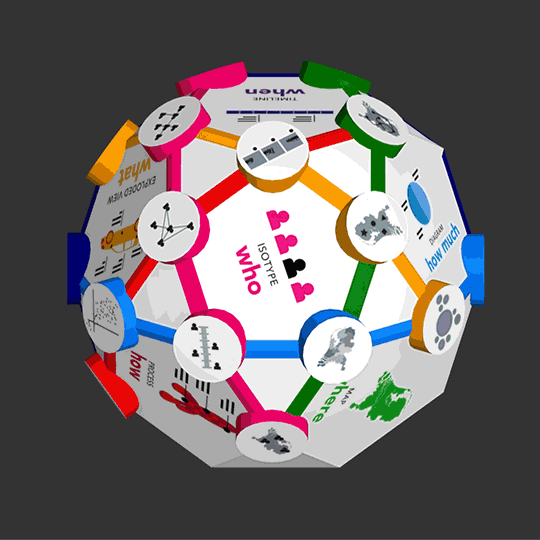
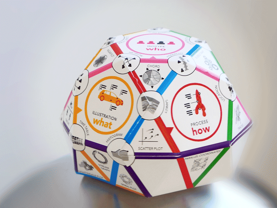
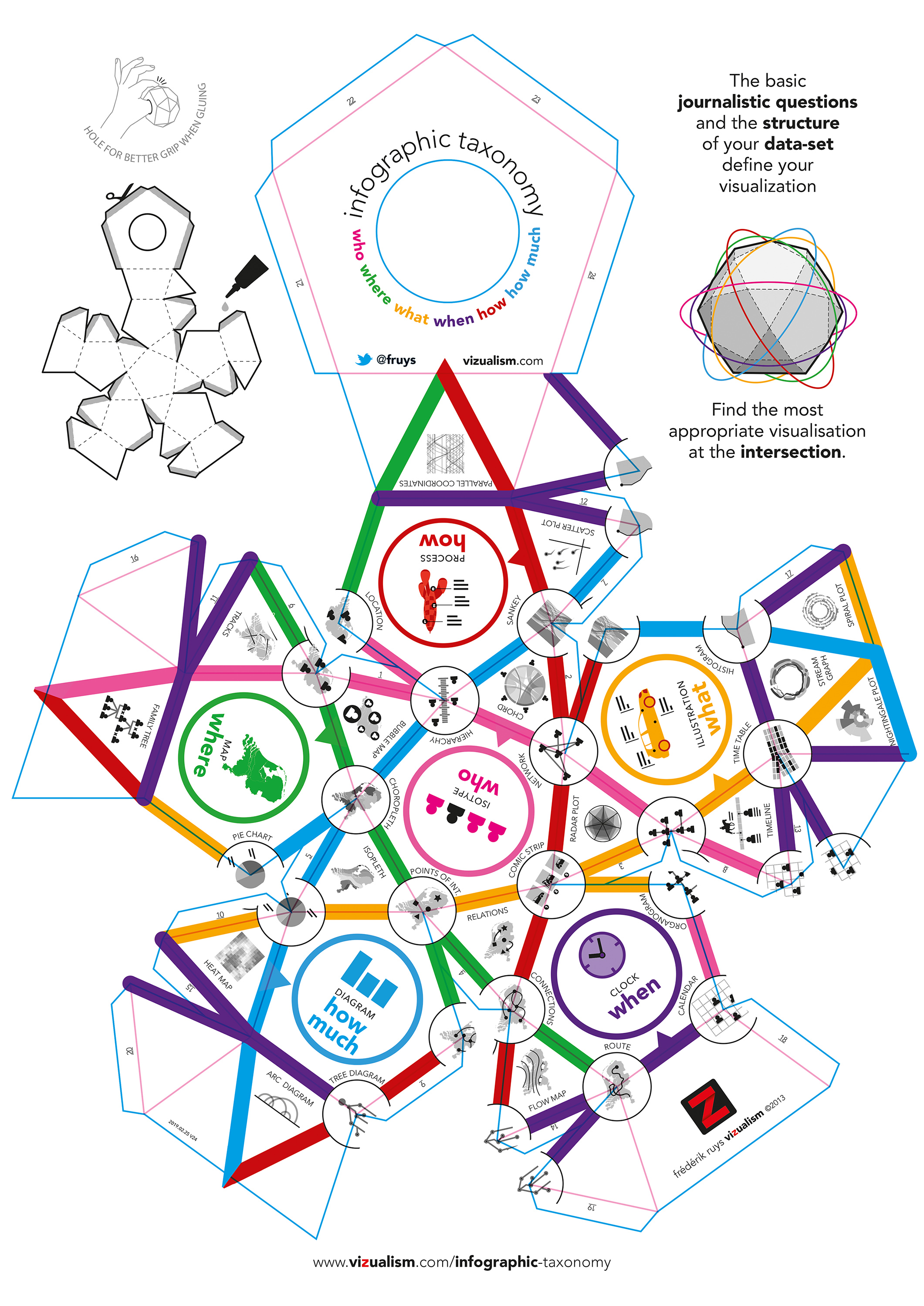
Infographic Taxonomy

It can be hard to find the most appropriate visualization method. But the basic journalistic questions and the structure of your data-set already define your visualization. To help you find it, I build this taxonomy.
PentagonWithin each pentagon you'll find one of the journalistic questions:
IntersectionCombine two colors, like WHO and HOW MUCH, to find at the intersection the most appropriate visualization. In this case: the hierarchy of persons (or objects) based on values.TriangleWhen combining three questions you'll find the visualization within the vertices in the corresponding color. So the combination of WHO + WHERE + WHEN results in 'Tracks' of people (or objects) through space and time.Glue your own!Have your own Infographic Taxonomy-cube (which I constructed using a polyhedron: a icosidodecahedron) by sending me an e-mail f.ruys @ vizualism.com. No need to use your pair of scissors; you'll get a pre-folded and laser cutted plan to glue your own Infographic Taxonomy. Design: Frederik Ruys. |
|